TASK BRIEF:
Design a “Simple” product that provides the ability for the client to complete two associated tasks, with the same solution, using inspiration from past assignments. Make sure the product deserves to exist.
“Kill two birds with one stone”.
IN CONTEXT RESEARCH :
HOSPITALITY:
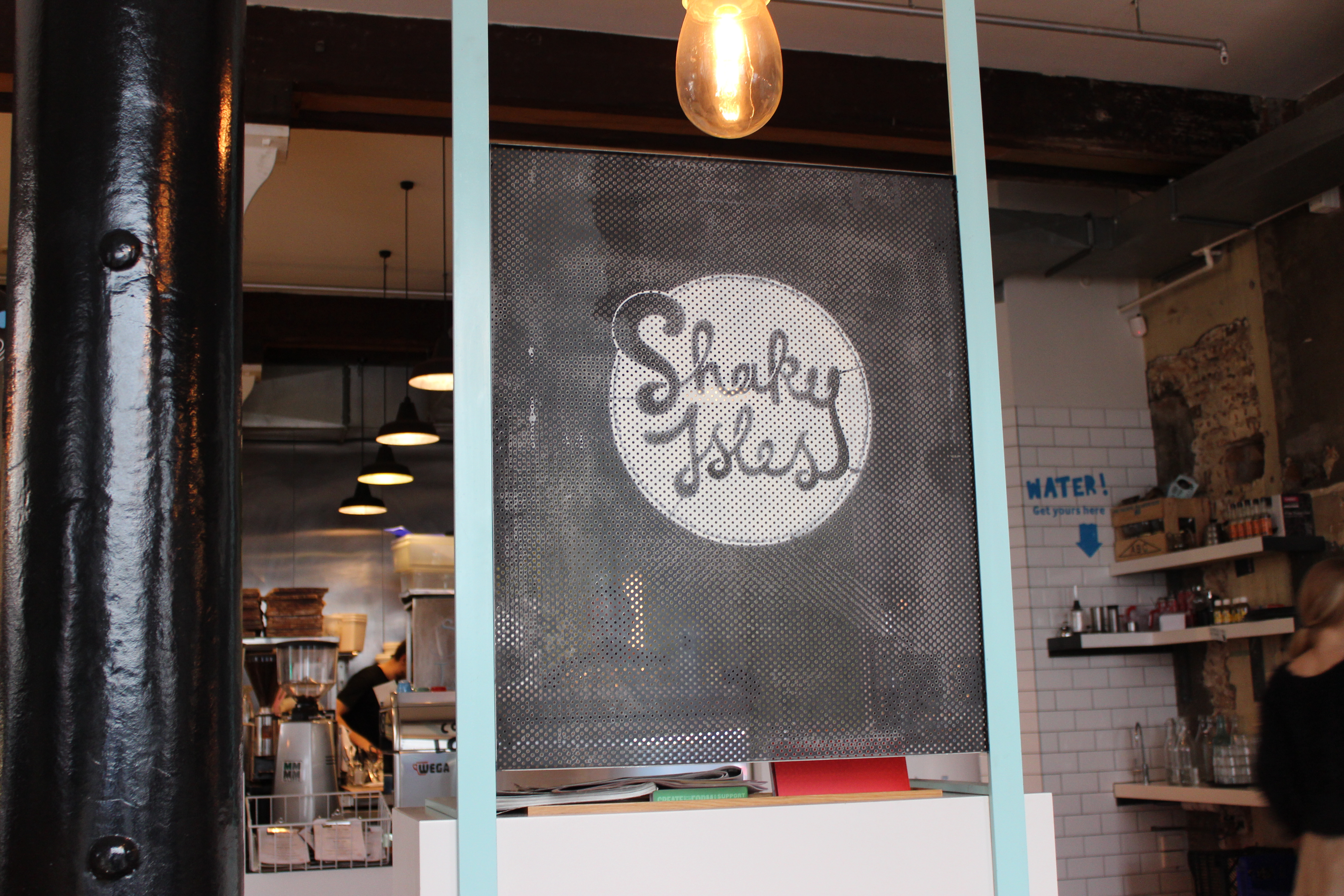
TYPE: Cafe
NAME: Shaky Isles
Shaky Isles is a humble cafe located in the Britomart area of Auckland city. In the company’s words, ‘Shaky Isles’ stands for “All the is good in New Zealand” and the delights within. They believe that all New Zealanders are easy going and know how to sit down and enjoy a good meal, and great coffee!
MY EXPERIENCE:
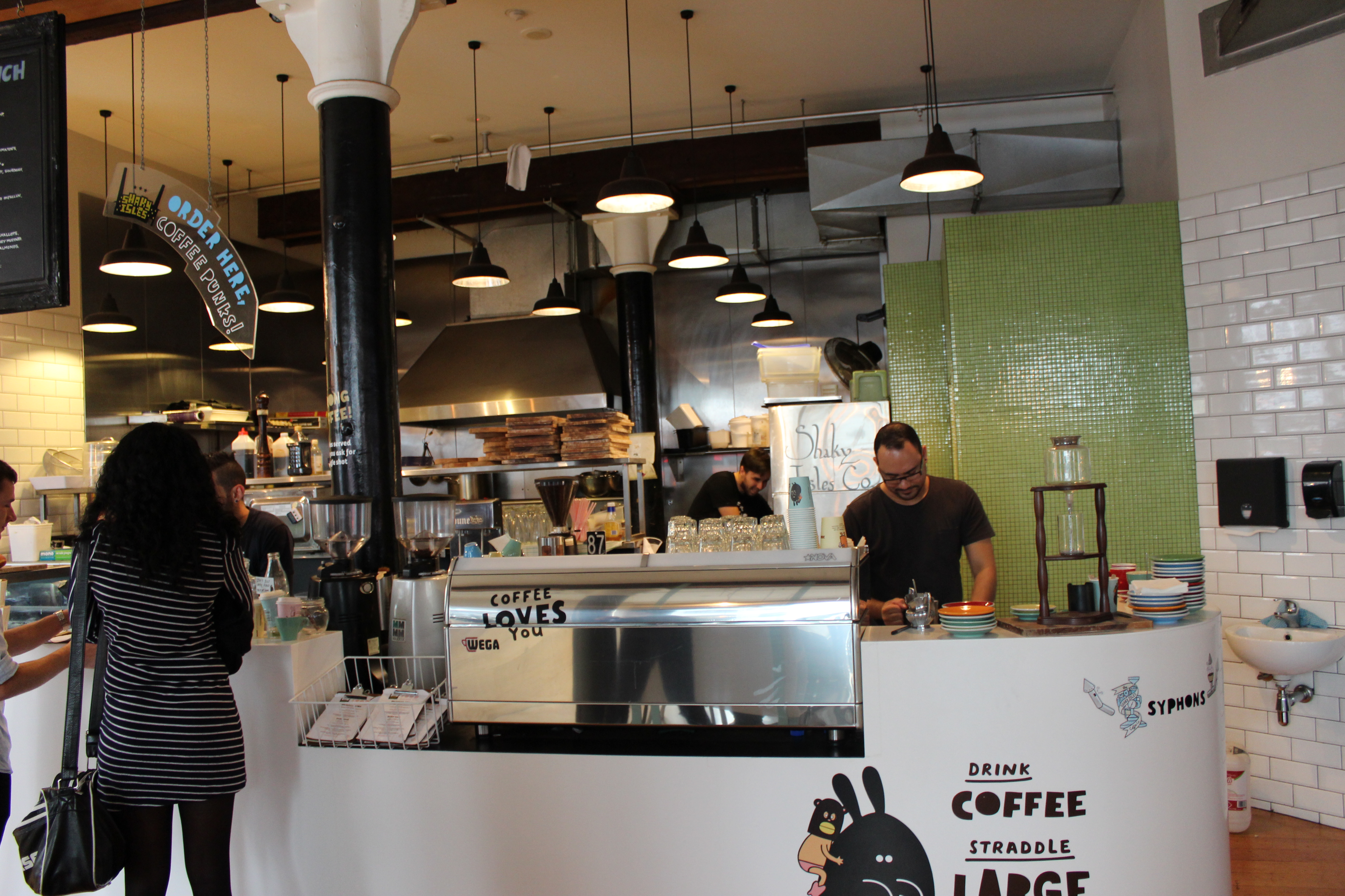
My overall experience was very pleasant. The staff were all extremely friendly and the atmosphere was welcoming, with great music and free WIFI.
 PROCESS:
I watched the workers at the counter and took notes of the steps they go through when taking someones order.
- Customer walks in
- Greats customer
- Takes order
- Gives Customer a number
- Customer takes seat
- OR If the food is cold cabinet food, customer takes food to table
- Gives order to kitchen out the back
- OR heats order by self
- Order is brought to the customers table.
- Payment is made when order is being placed
Looking around the cafe, I noticed some thought out structure to the way the store runs.
- WATER STATION: The cafe had a water station by the counter. This made it easier for the staff because they didn’t have to bring water over to the customer, and distract from the kitchen and greeting. This was also a benefit for the customer because they could get water as they pleased.

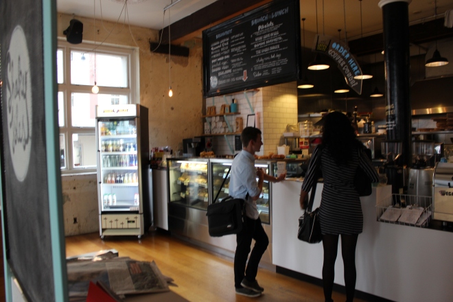
- COUNTER: The counter was by the door and had an obvious arrow pointing “ORDER HERE” to ensure no confused customers. The counter is also by the door which minimizes aimless customers walking around the store.

- TABLES: Having table numbers is an efficient way for the workers to know where the food is going, and have fast service. The tables also had boxes with condiments inside, This is a interesting way to provide condiments. It also allows customer to not have to leave their seats, as well as not calling over busy workers.

I also noticed some problems around the cafe, and also problems that I think the workers would have.
- CLEANING: Shaky Isles is quite big with two levels. The store also has very high ceilings and tall windows. I think that it would be a problem for the workers to keep the seating areas clean while the cafe is packed full. It didn’t look like there were any waiters. There was also a piece of lettuce on my table when we arrived. The tall windows would be a hassle to clean, along with the large floor space.

- ORDERS AND PAYMENT: Because the entrance is by the door, the customers do not have much room to line up when the cafe gets busy. Also, some customer would rather pay after getting their food. Some people don’t like to pay for something they haven’t tried yet. Some form of at table ordering and payments would minimize this.
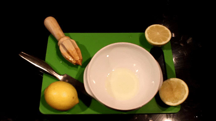
 TYPE: Food
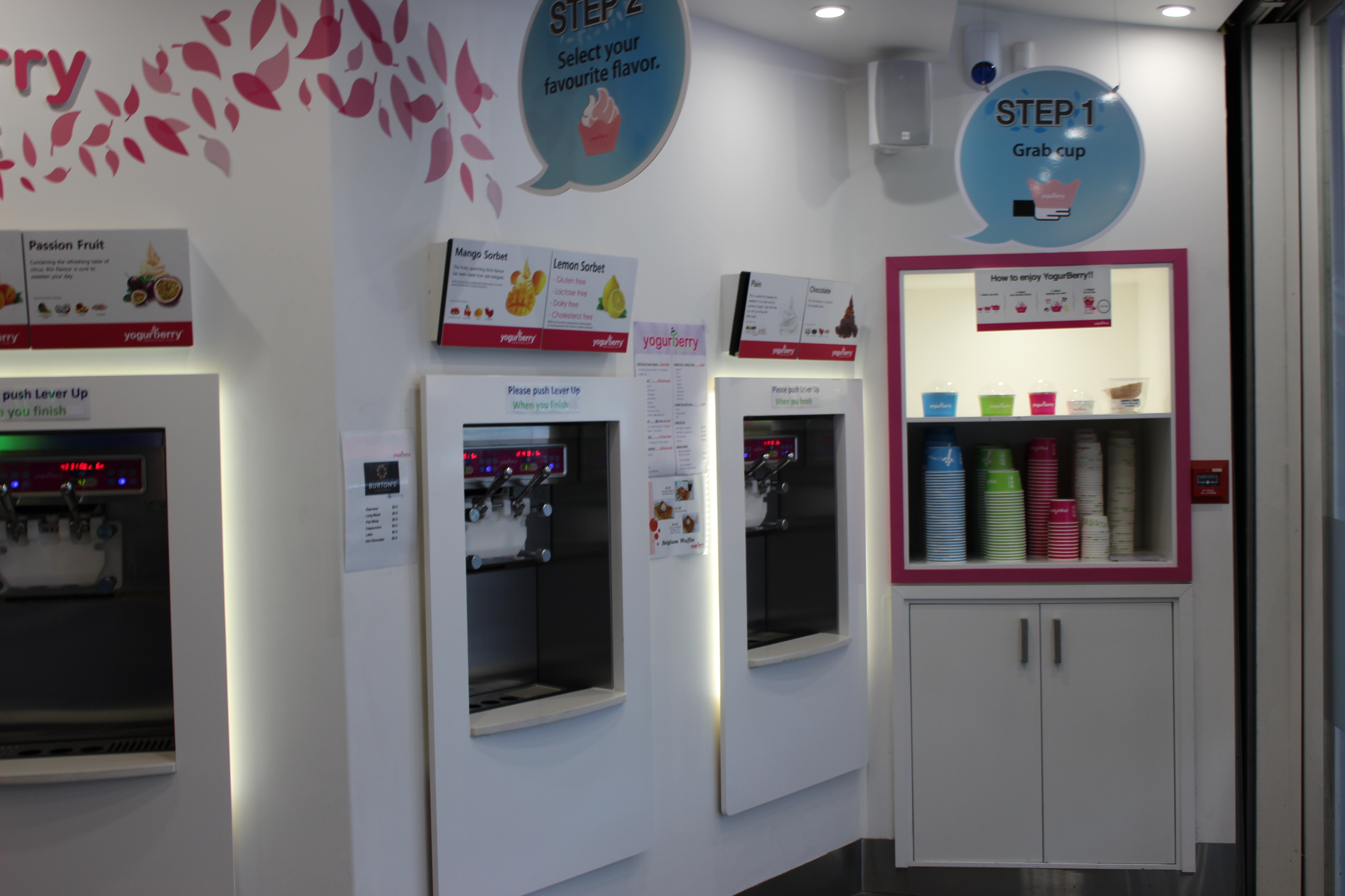
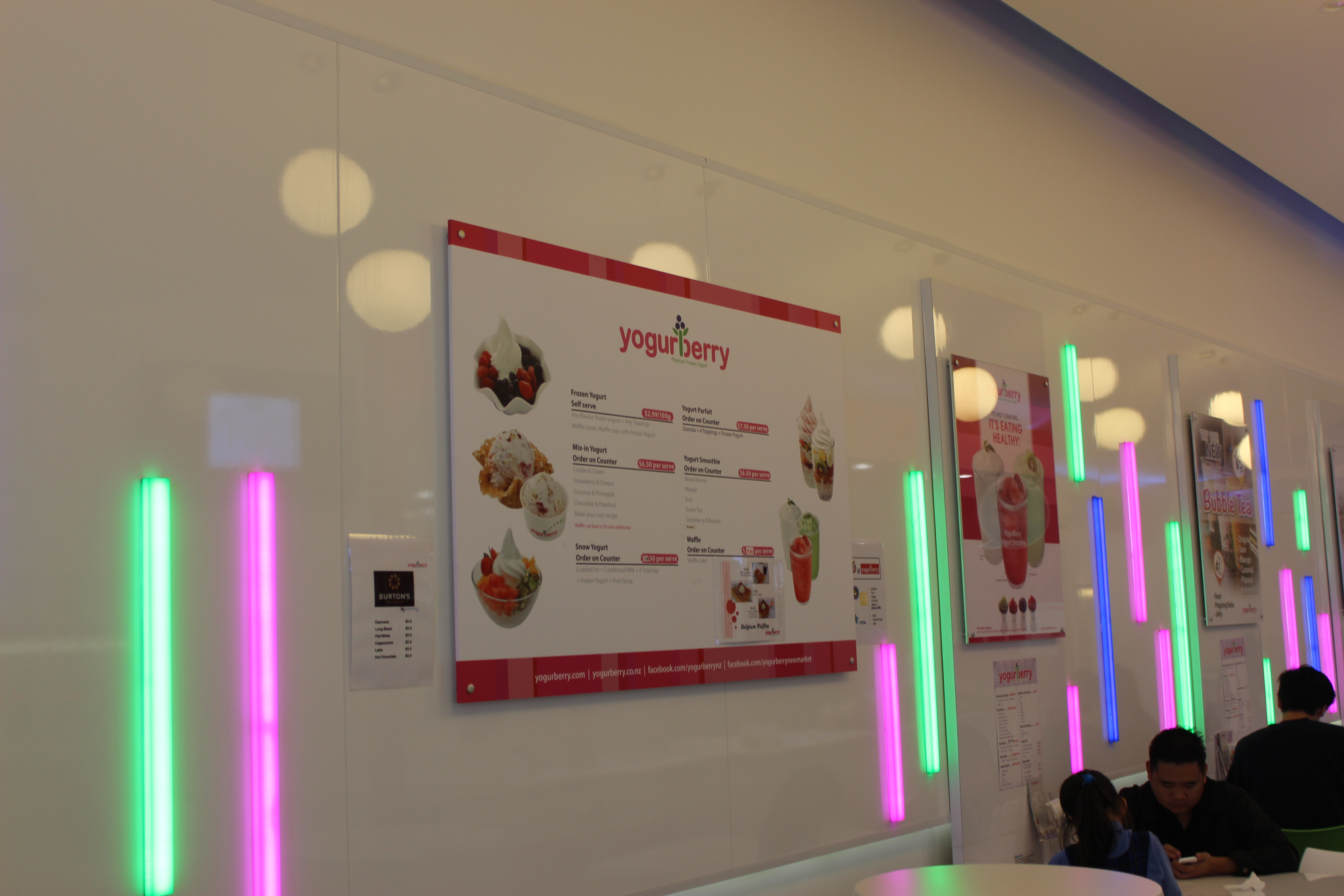
NAME: Yogurberry
Yogurberry is a self serve frozen yoghurt chain. The store I visited was located in New Market.
Process:
The store function with a “chain” style process.
- Customer choses cup
- Customer self serves yoghurt
- Customer chooses toppings
- Chain ends at counter
- Customer pays
Yogurberry has already developed a thought through process that makes the customers experience run smoothly.
BENEFITS:
- CHAIN: The chain process is very smooth and easy to follow, with large signs.


- PHONE CHARGING: The store has multiple phone chargers at each table. Not only does this keep the customers happy, it also draws in new customers who are looking for a place to charge their phone.


Looking around Yogurberry, I found some problems that the store could/would face.
- HYGIENE: Even though the toppings are covered, they are not kept cool, and also have spaces for fruit flys to get in on hot days.
- STAFF: I found that the staff were unfriendly and not very connected to the customers, since the operation is customer driven. It wasn’t a very welcoming environment.
 TYPE: Transport
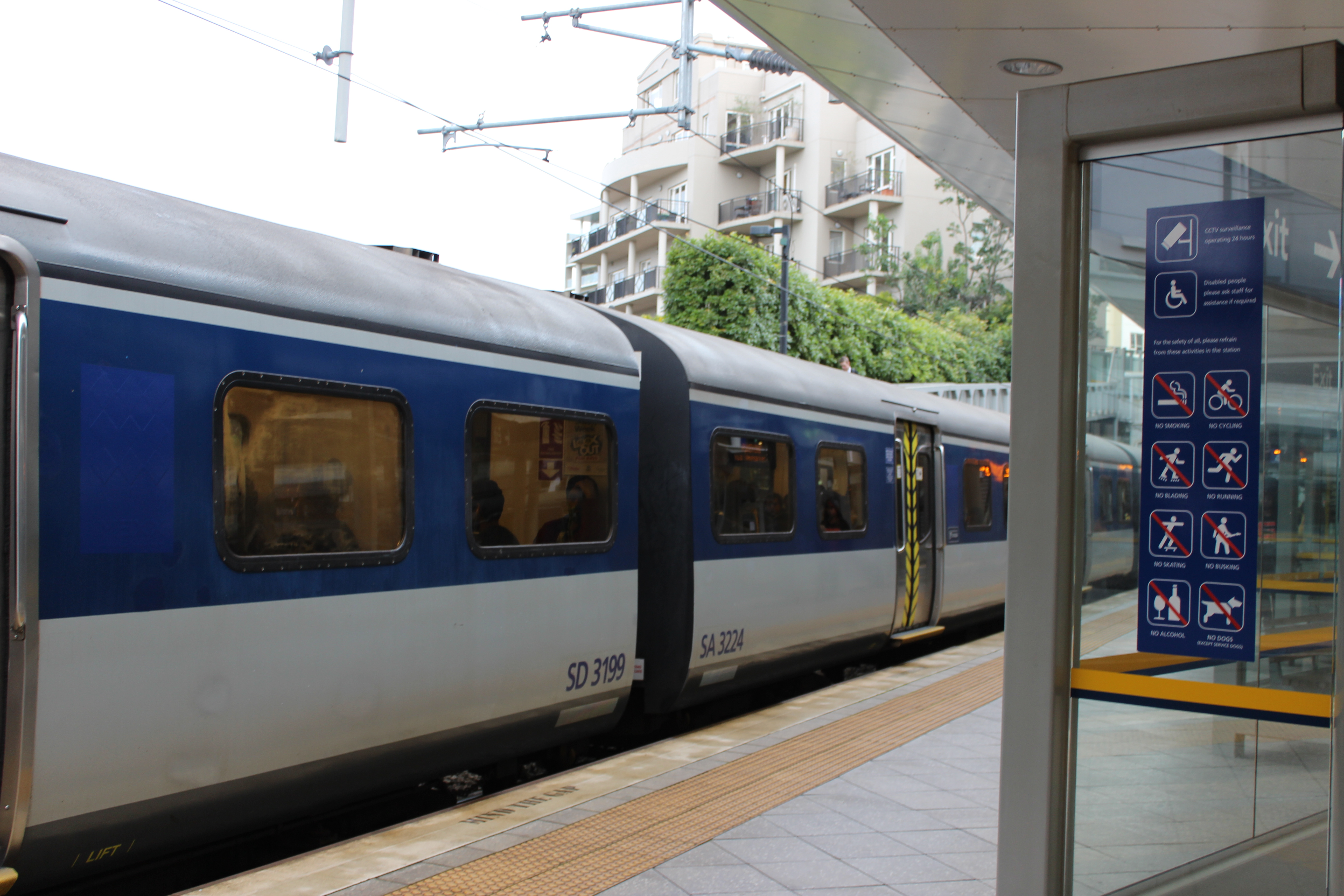
NAME: Train Station(s)
Auckland Transport (AT) is a day to day task that most of society use.
I wanted to look at Auckland Train Stations, to see how they run and the Process that the user goes through to get to their desired Location.
PROCESS:
Without AT card:
- Buy ticket at counter or station
- Go to train arrival area
- Show ticket worker and be let through small gate
- Go to plat form
- Get on train
- Watch digital location signs
- Workers walk around and check tickets
- Get off at stop
With AT card:
- Go to train arrival area
- Swipe card and let yourself through small gate
- Go to Plat form
- Get on train
- watch digital location signs
- Get off at stop
- Swipe card off at arrived station
As for the process of train transport, it is clear that the process is faster and easier with an AT card. Here are some other positives when using train transport.
BENEFITS:
- SIGNS: Large signs that can be seen through station. very clear directions, as well as train times
- TOP UP STATIONS: easy way to top up at card
- TICKET STATIONS: alternative to going to counter, rolls through faster. Can use card or cash
- TIME: Trains are always on time
WHAT I NOTICED:
Here is what I noticed when taking the train
- Mainly everyone were on their phones
- Ticket workers didn’t check tickets
- Very busy
- If you purchased ticket, Long line to get in to plat form.
 TYPE: Social
NAME: Courtyard/part
The New Market Courtyard area is a beautiful space, surrounded by cute cafes and stores. This public area is local to many business areas and buildings, which gives them a nice place to relax from their busy work day and eat lunch.
PROCESS/ WHAT I NOTICED:
- People eating lunch
- Kids and families
- Workers (people is nice outfits/suits)
- General mood of “happiness”
- Lots of people
- People there around dinner time
- cafes were busy
- interesting stores surrounding
- Birds

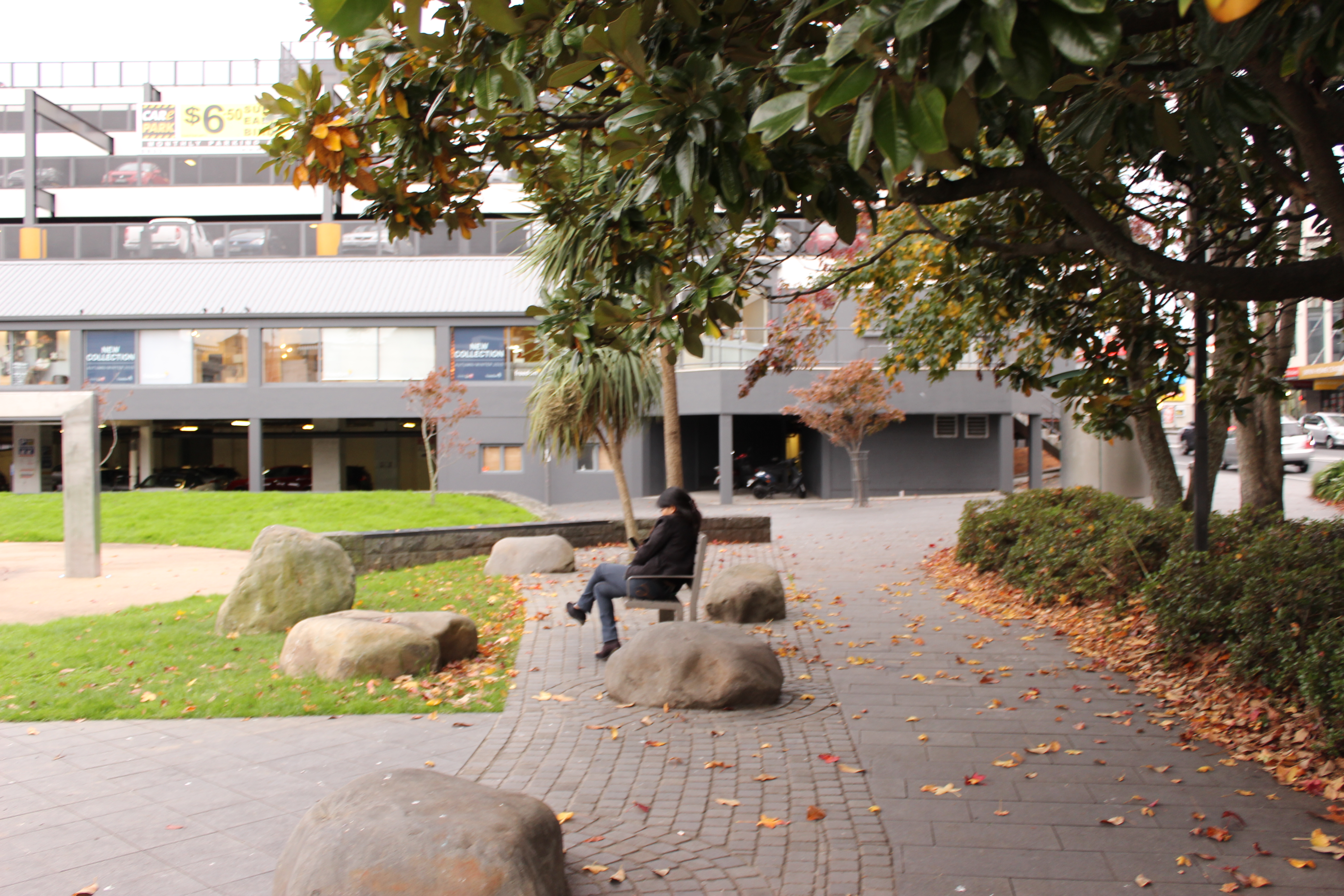
This beautiful area has a central water fountain as well as other architectural benefits.
- Plenty of seating
- Grass is kept short and green
- Flat surfaces, suitable for picnics and bike riding

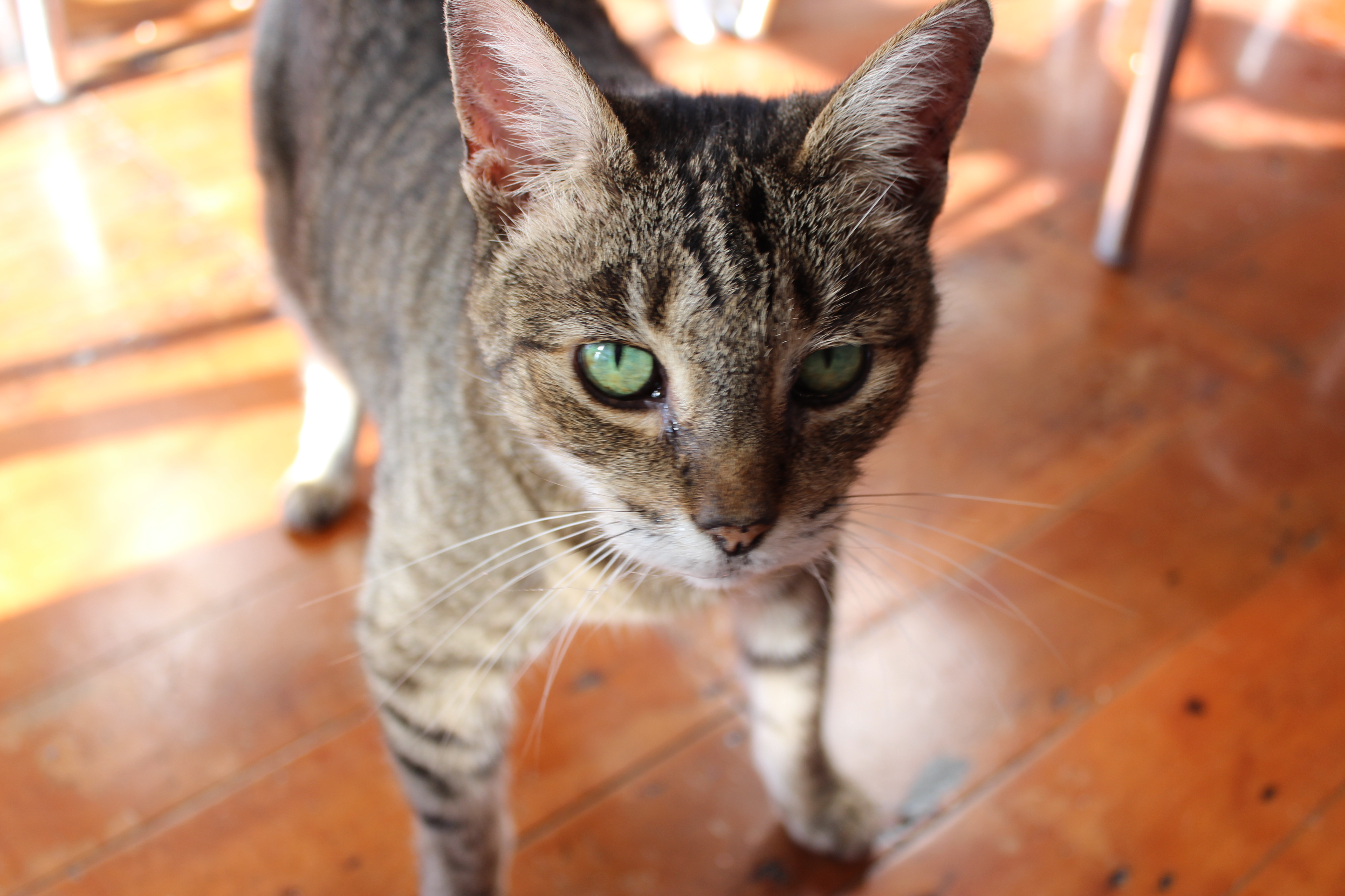
TYPE: Pets
As an animal lover and pet owner myself. I personally know the pros and cons of having a pet. I thought it would be interesting to look into the process of my own Cats life, as well as seeing other peoples experiences with their pets.
PROCESS/ DAY IN THE LIFE:
- sleep, sleep, and more sleeping
- eating
- drinking
- Disappears for a while
- Plays with her toys
- Plays with/scratches furniture
- Flea treatment and groom
- Cuddles
All pets have different patterns and activities. I talked to family members, neighbors and friends to get a better idea their pets problems and activities.
- A lot of feeding
- walks for dogs
- grooming (long haired pets)
- remembering poo bags
- loosing cats
- pet safety, running away ( rabbit )
- loud barking
- leaving pets alone
- where to let their pet sleep – big beds are obtrusive
- cats scratching furniture
- dogs ruining owners belongings
- where to store dog toys
- where to store cat toys
- where to store cat treatments
- vet appointments- booking and remembering
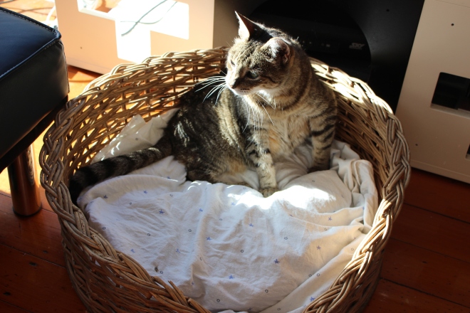
The problems that I personally have for caring for my cat is her bed gets in the way, and even though she has a nice bed, she prefers to sleep is a storage box.
From what the people I talked to said, I also agree that pet supply storage is annoying and hard to deal with. When my cat plays with her toys, they are hard to find over the house. I also never know where to keep her flea treatment and other medical and grooming supplies. 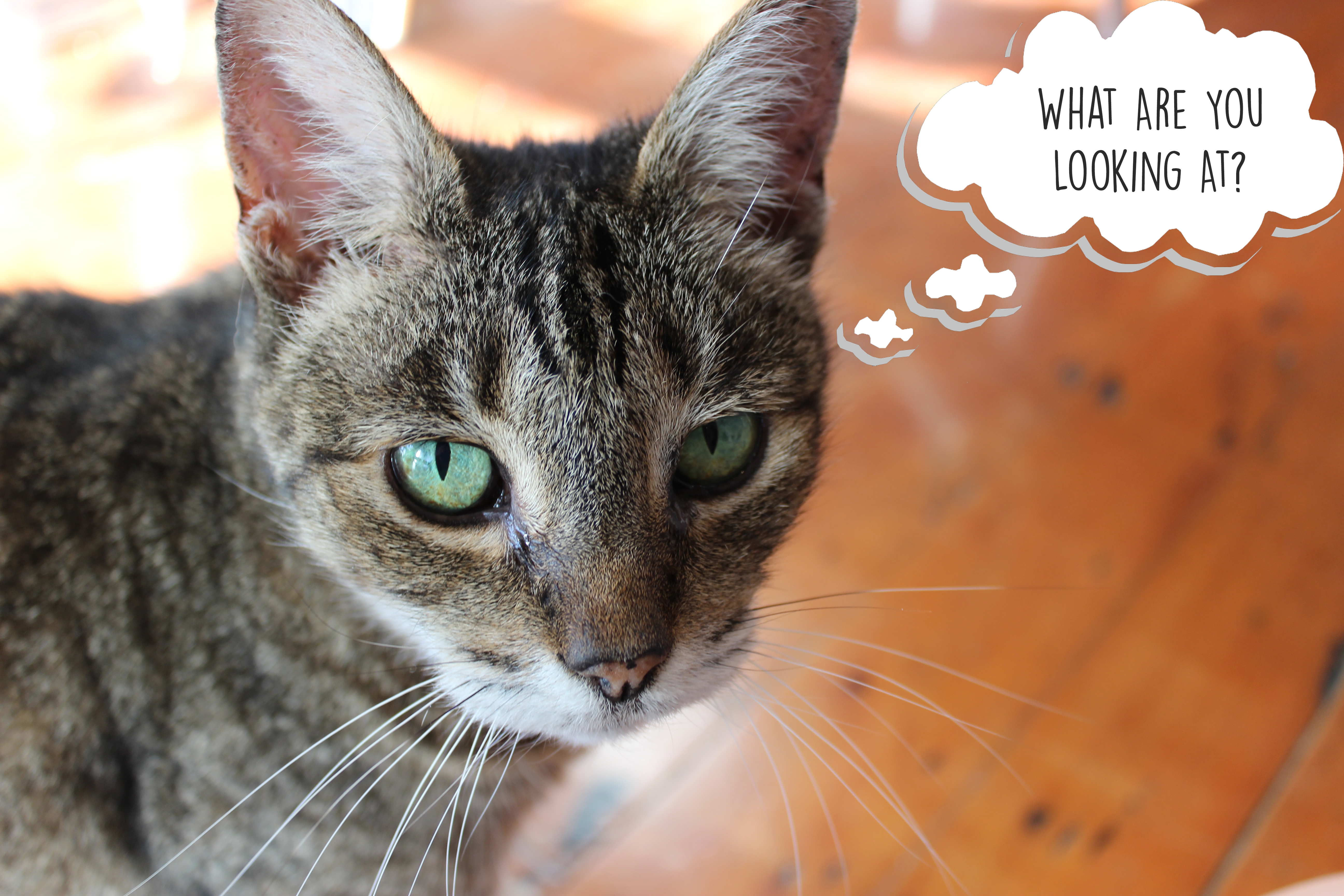
Chosen Focused Area: PETS
WHY PETS?:
Being a cat owner myself, I feel like I am familiar with the responsibilities that come with owning a pet, and I am not alone. According to the NZ Animal Protection Program, 68% of all New Zealand homes own at least one pet. I went out and talked to neighbours friends and family and asked them about their experiences with their pets. Just like humans, pets have different needs.
I wanted to focus on pets because of the large number of families with pets around New Zealand. I also feel that I personally have a large knowledge about owning a pet that will help me when it comes to research and development.
DUAL PURPOSE:
The two categories that I will be looking at is pet health storage and pet bedding.
When talking to other pet owners, I found that a problem a lot of people mentioned was lack of storage for pet health supplies. Where do you keep all of your pets medication and progress book? It is good to keep these supplies close to the pet, so you can keep on track with treating them. If your cat or dog doesn’t have their up to date shots, they are unable to check in to a cattery or kennel.
Another problem that people mentioned was pet bedding. I was surprised that a lot of people said that they have gotten rid of their old pet bedding because it is two obtrusive, gets destroyed or not aesthetically pleasing.
I am going to design an object that combines pet bedding with pet health storage.
PRESENTATION:
Pet owners who live in modern compact homes face a big struggle with space. It is very hard for families in small homes who are wanting to own a pet. This inspired me to design a pet space that is unobtrusive and can easily be moved between room to room.
I decided to focus on cats. This is so I can make my product catered for cats and their needs. Cat bedding is much smaller then most dog beds and their medication is very different.
SPECIFICATIONS:
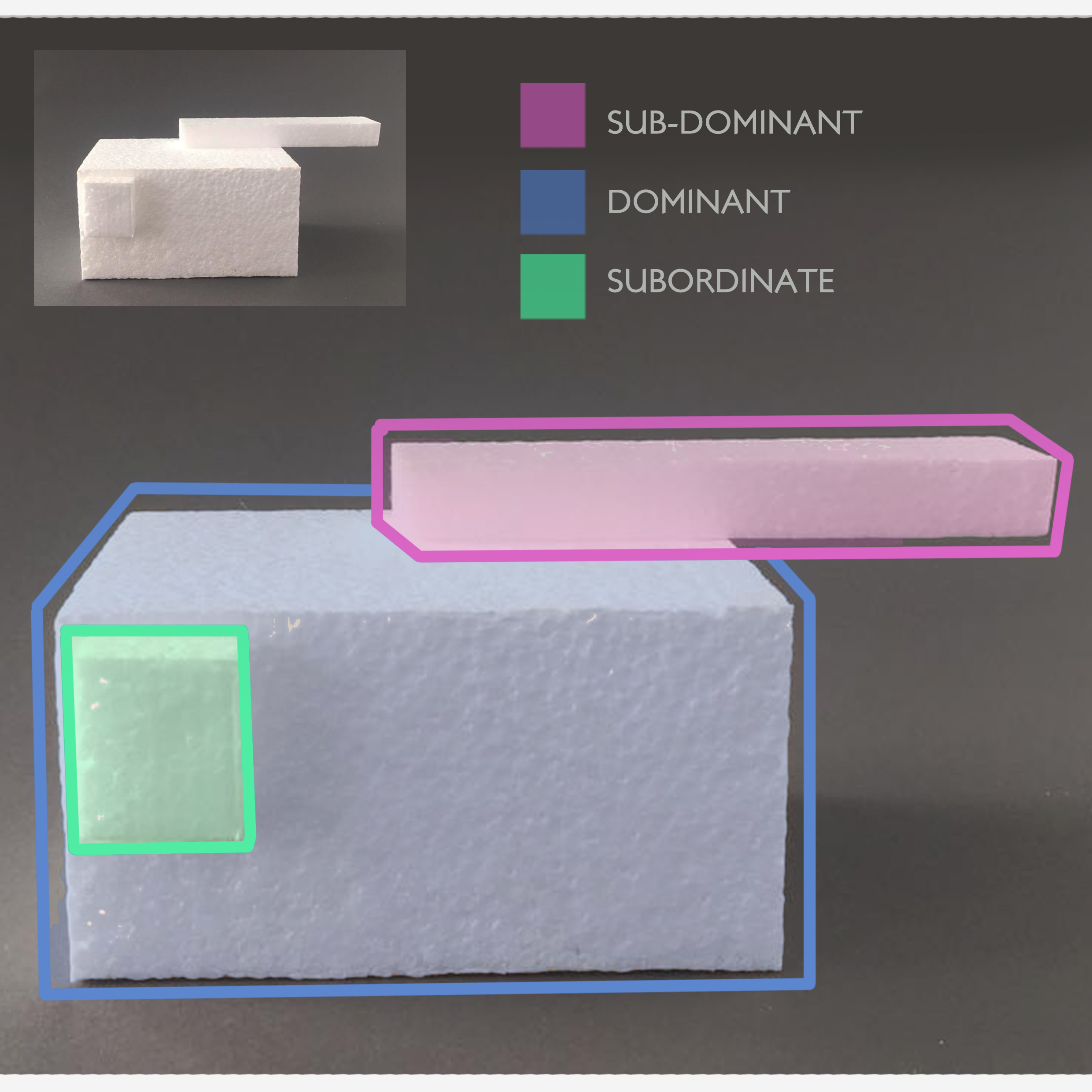
Health Storage:
- Storage drawer for pet health equipment
- 80 x 400 x 400
- Has four compartments
Pet Bedding:
- Has bedding for small animal
- Can fit a cat or small dog
- 320 x 400 x 400
Extra:
- Must be comfortable for the pet
- Portable. Able to be carried
- Pleasurable environment
- Outer dimensions : 400 x 400 x 400
Materials:
- Full sized scale model
- MDF
- Bought cushioning
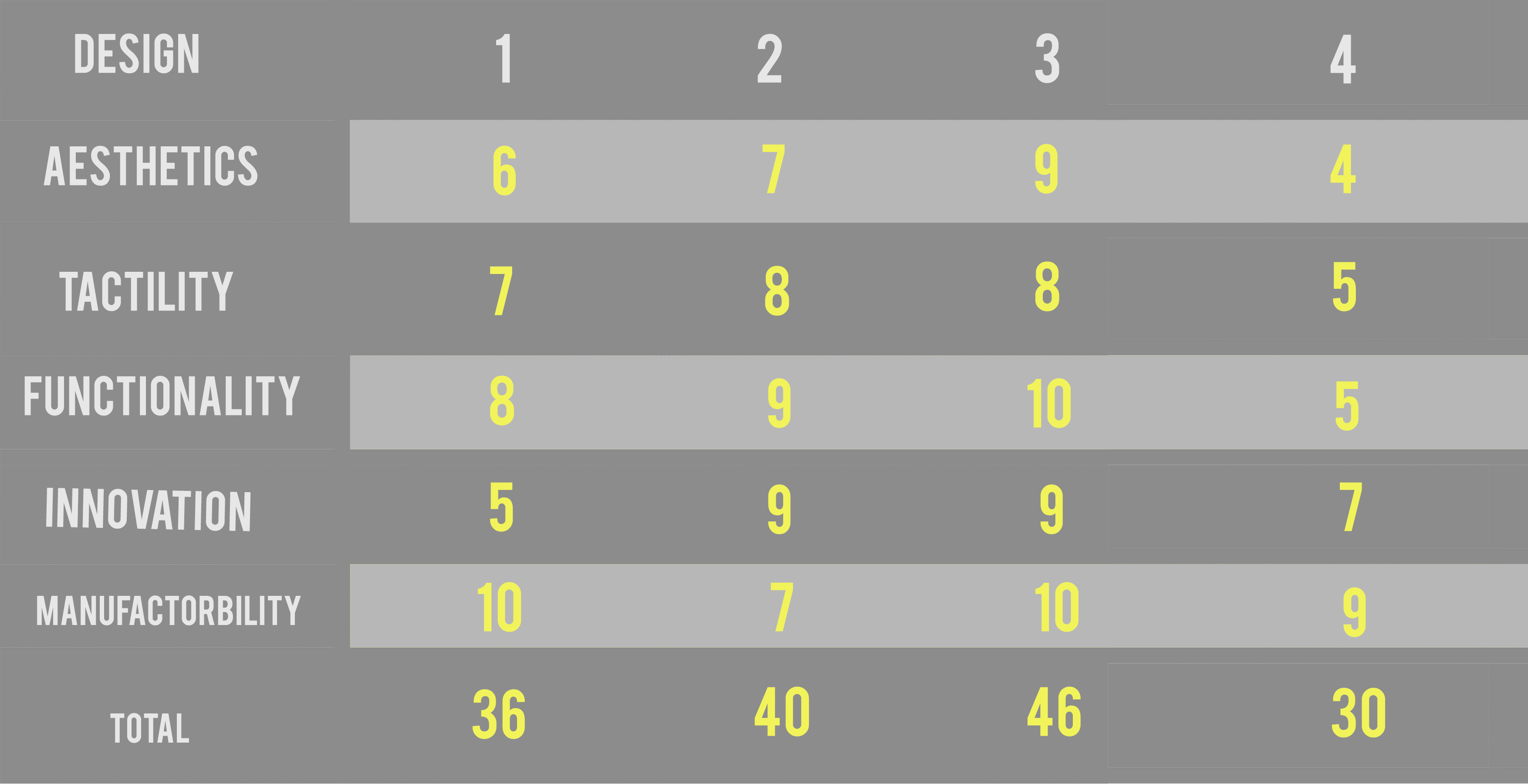
STYLE:
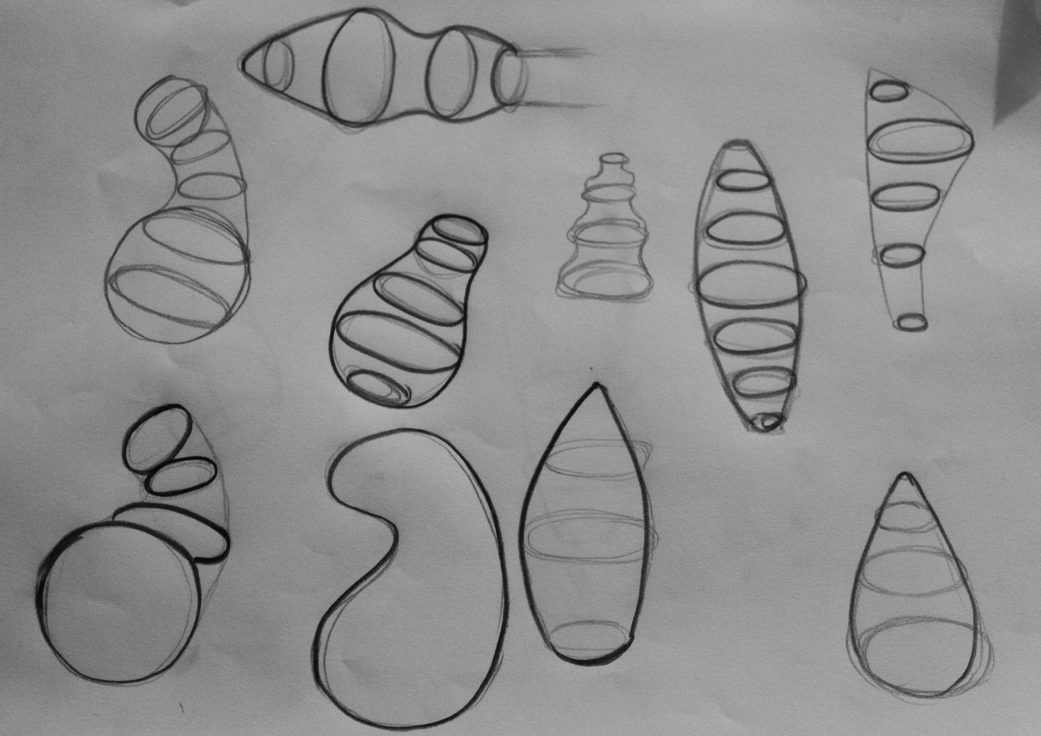
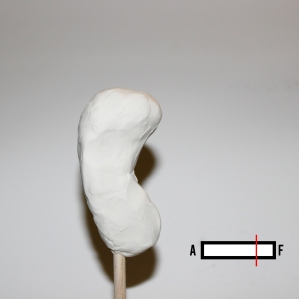
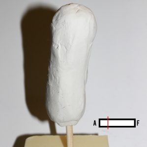
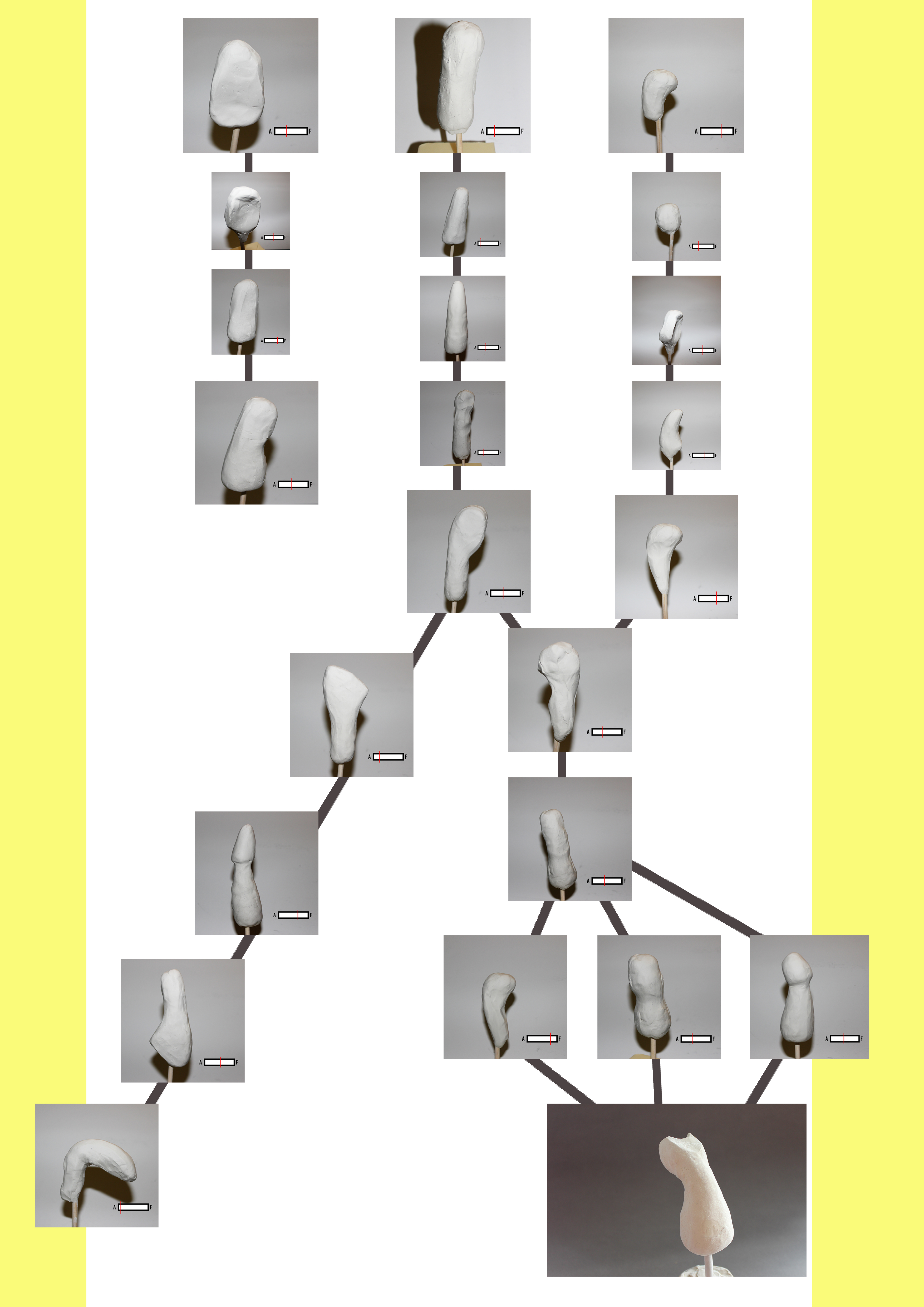
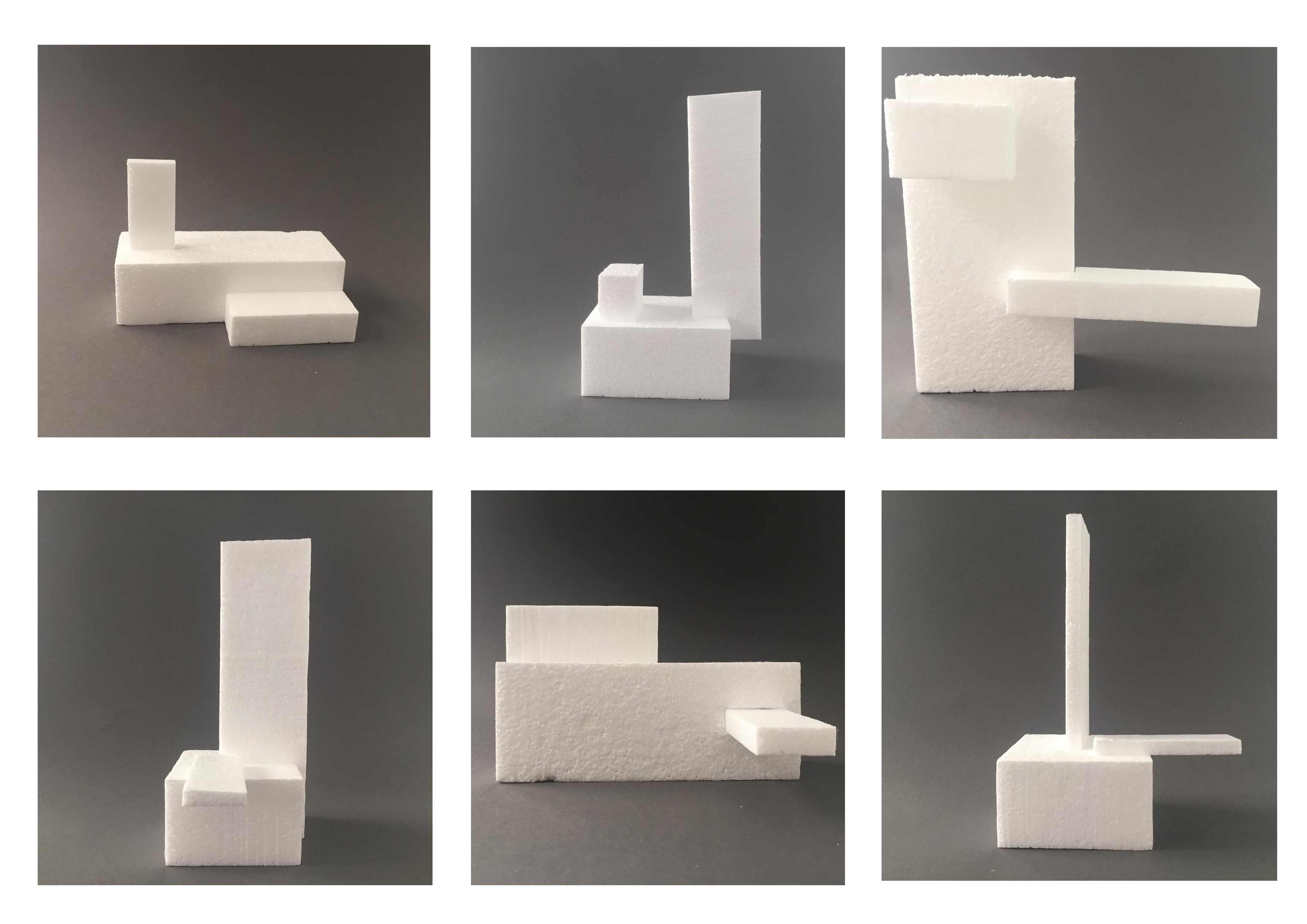
When deciding on a style for my design I wanted to experiment with a range of designs to find the best outcome to cater to my design brief. I played around with a range of developments.
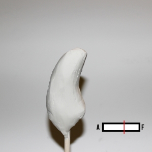
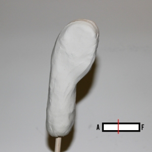
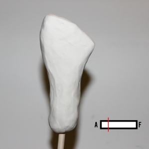
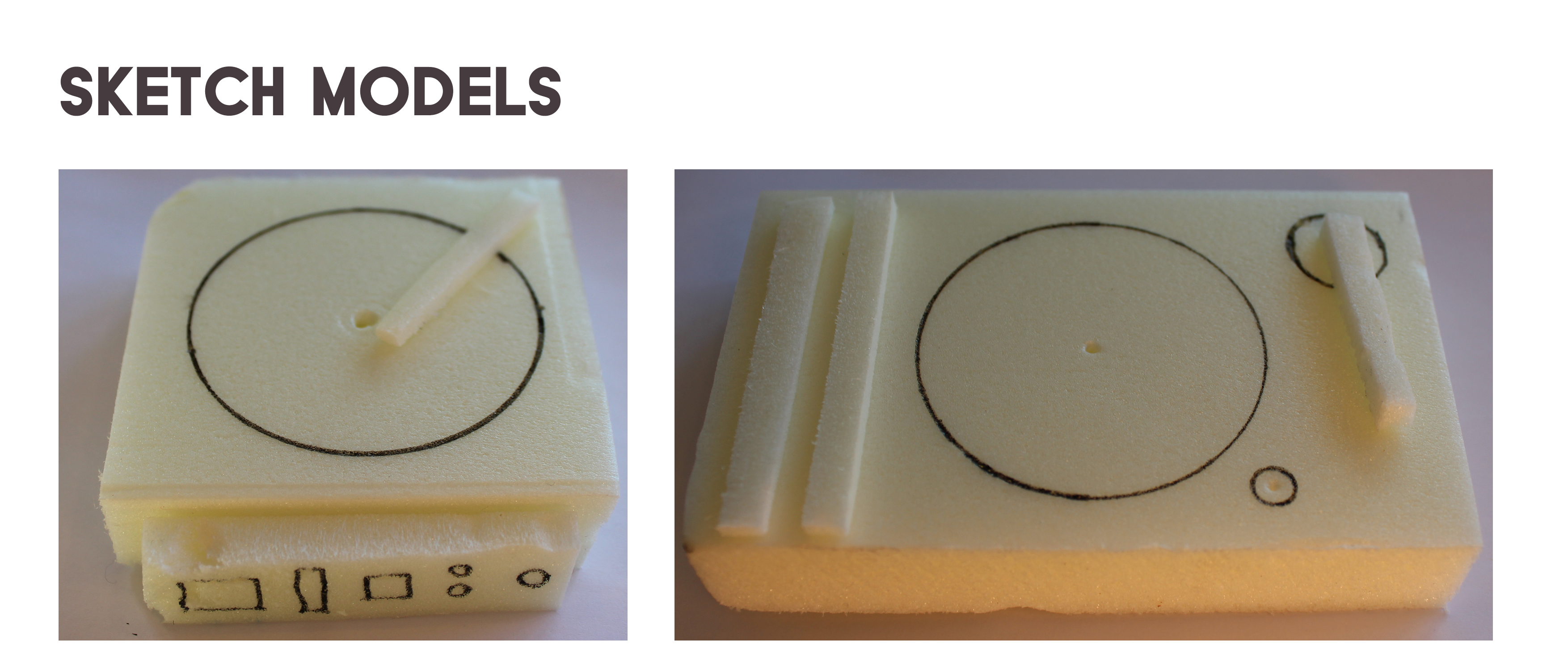
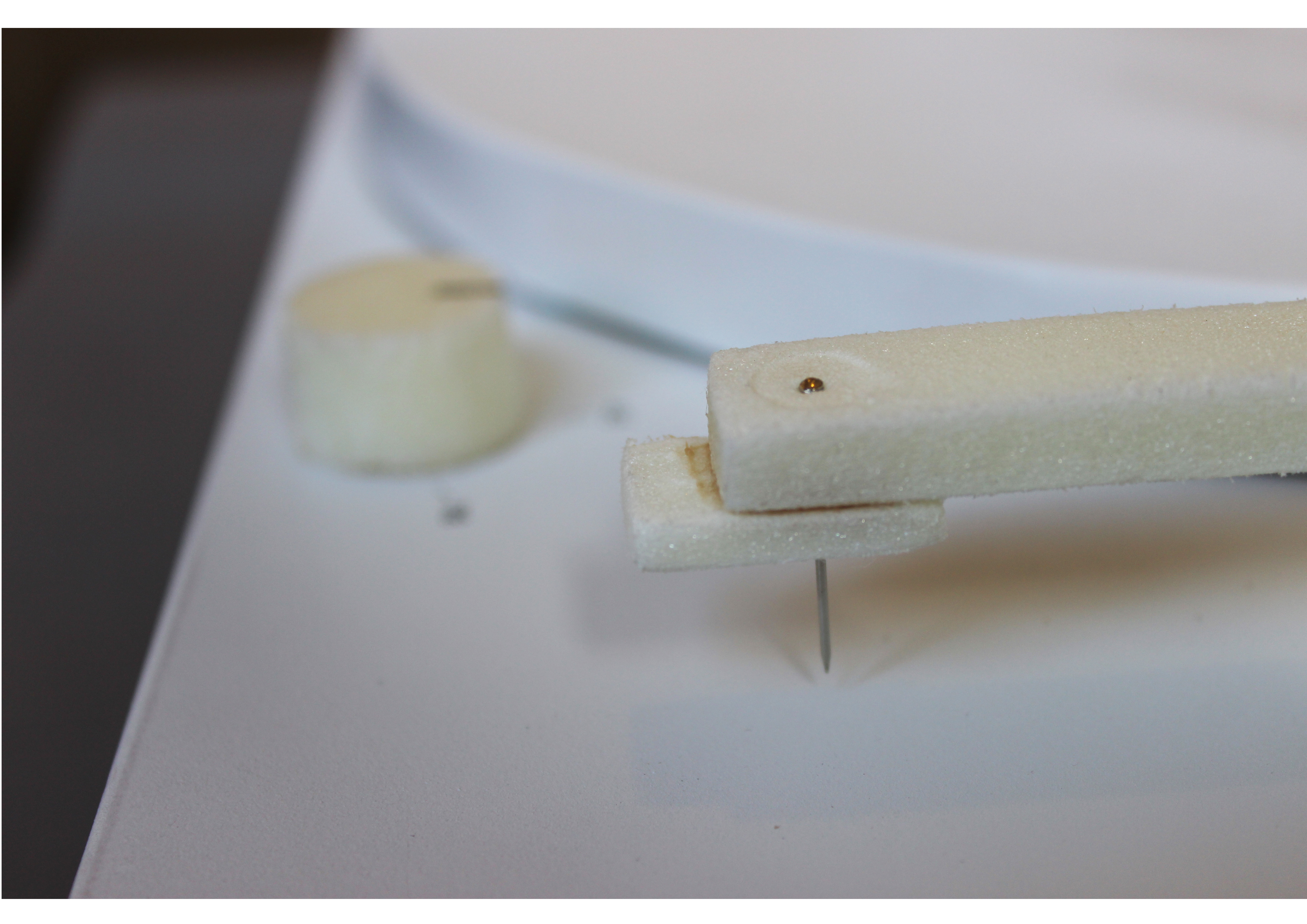
Sketch models:

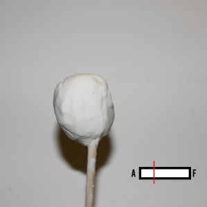
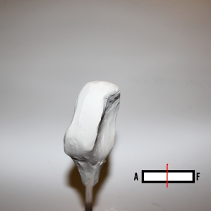
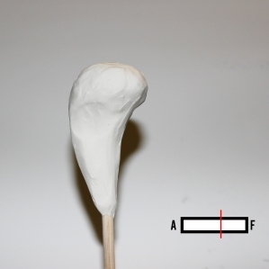
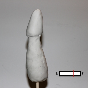
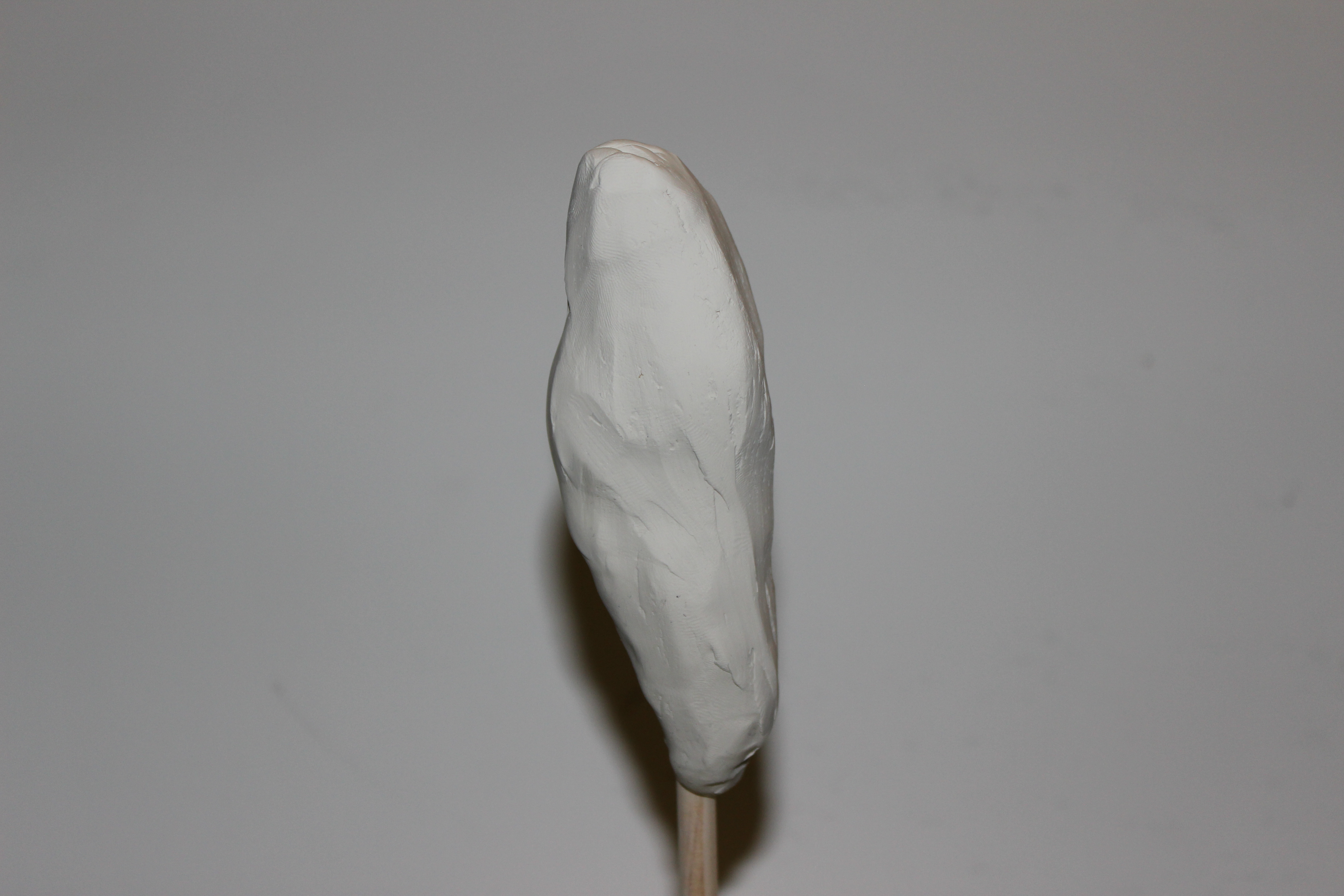
Bean Bag Concept:
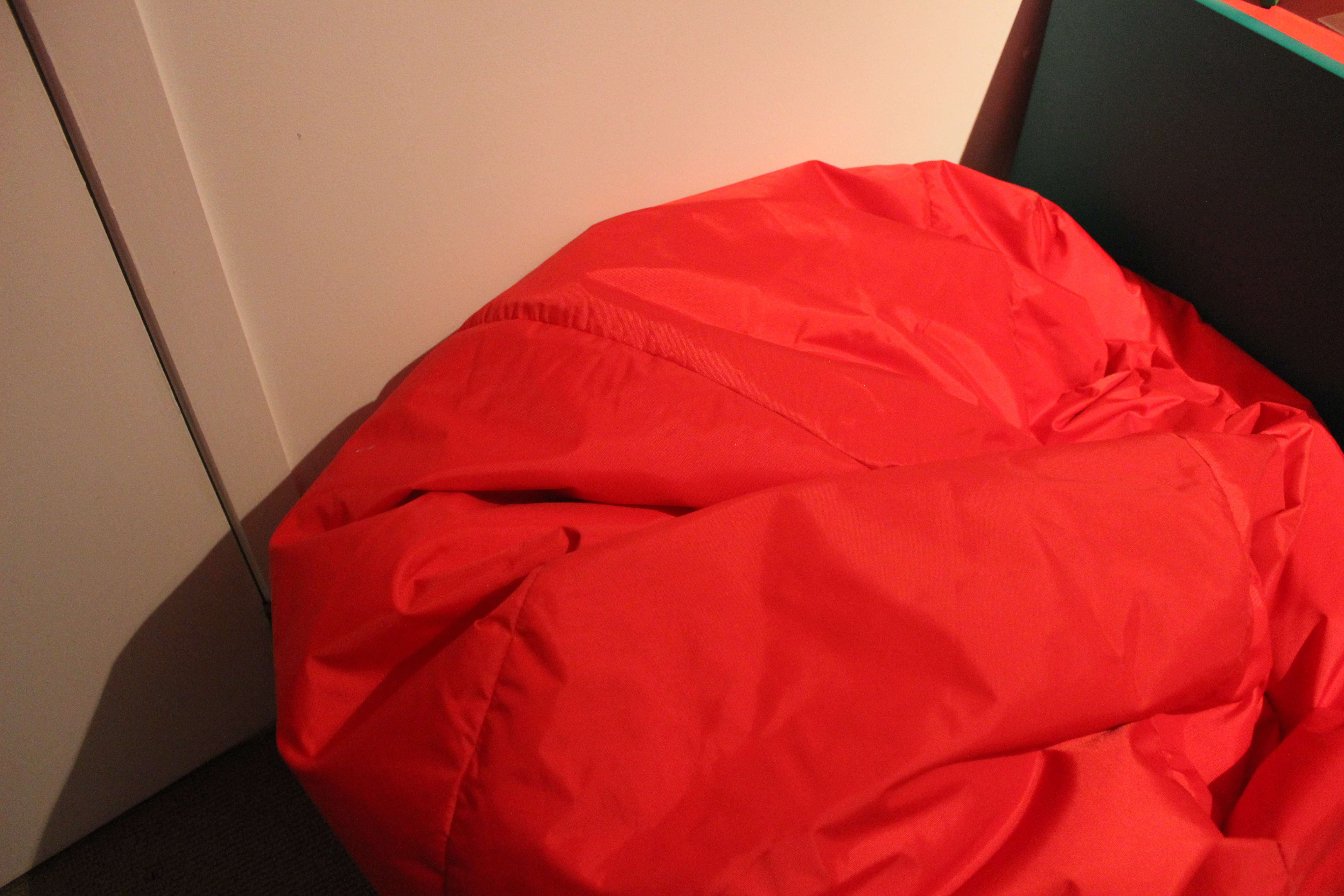
An idea that I considered was incorporating a beanbag styled bed with a storage system. I thought that this would give the cat a comfortable bed that is portable. Developing on this idea, I found that it was impractical to add a storage unit. This would effect the cats comfort and would be badly attached.
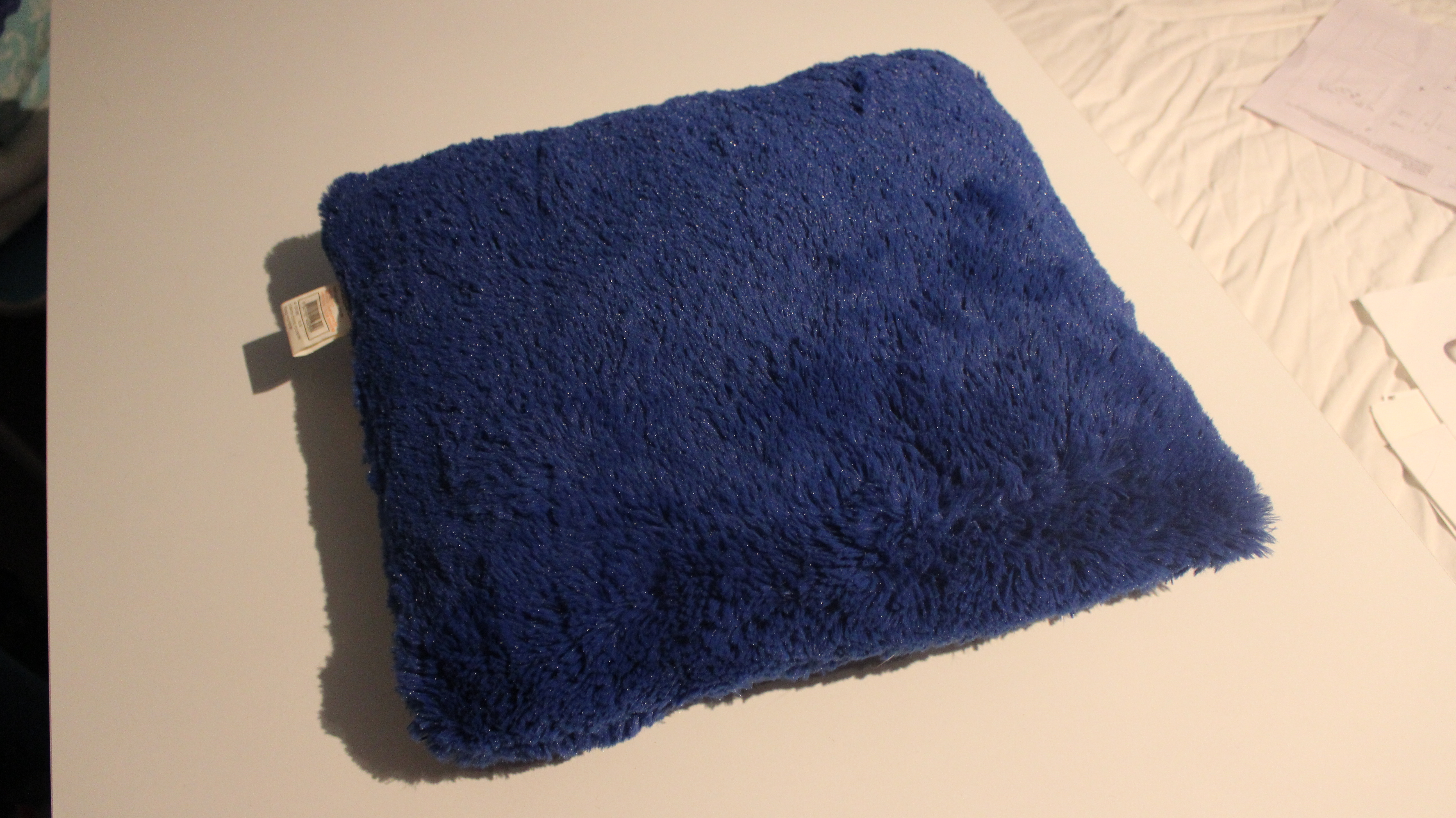
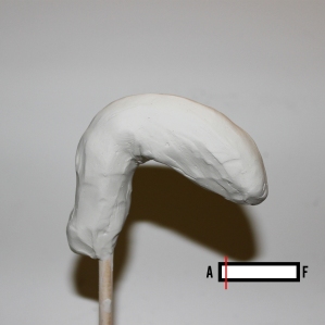
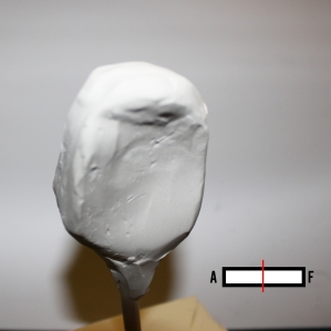
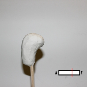
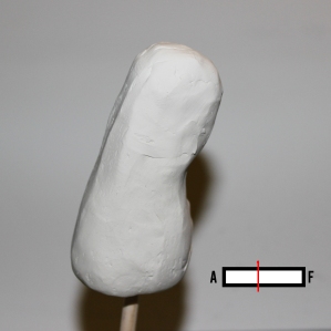
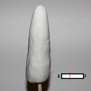
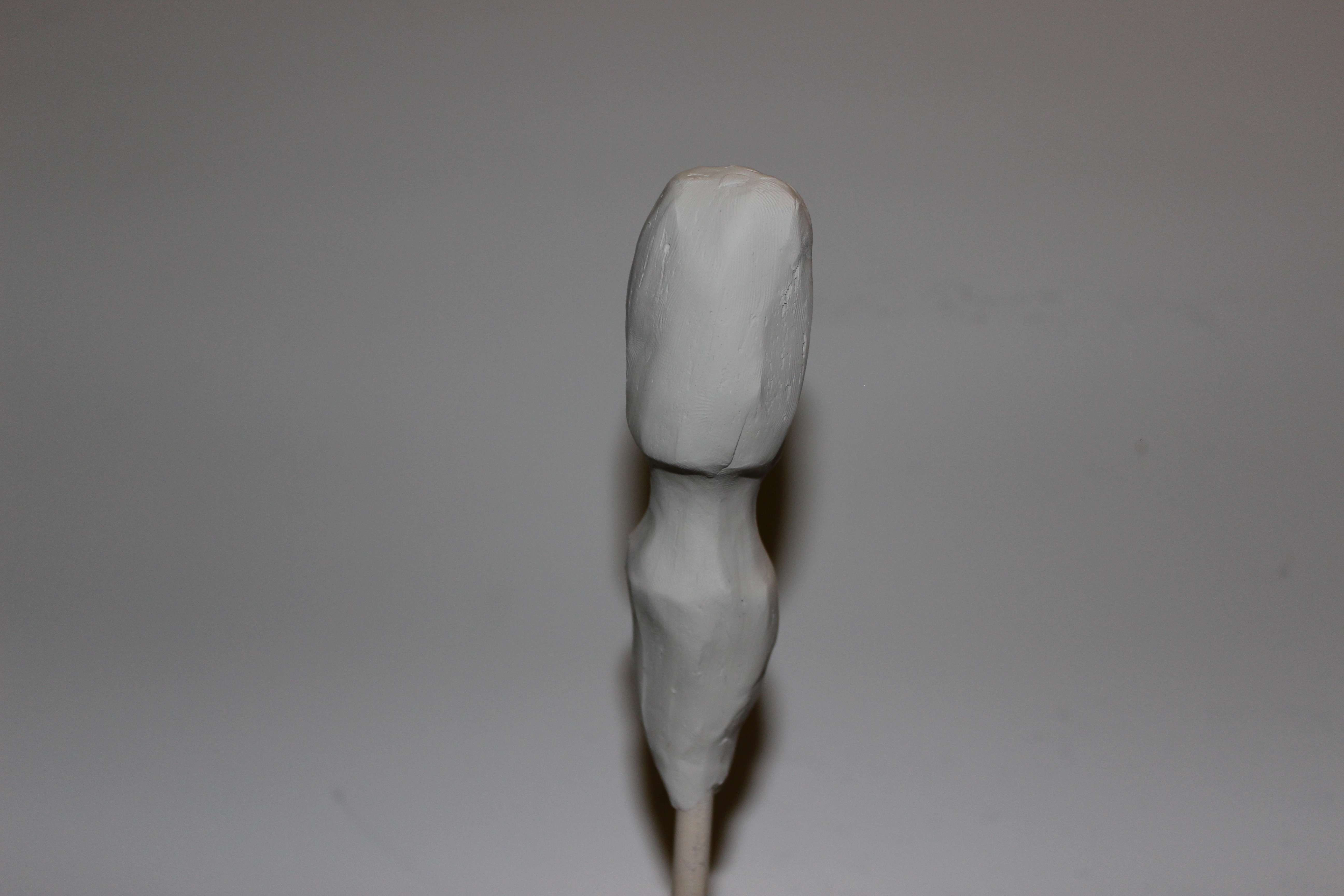
Cushion concept:
Cats love pillows and cushions. From a bedding point of view, I found that this is extremely portable and comfortable. The standard shape of a pillow (400mm x 400mm) would work well with the sizing specifications I have for my final product. I could incorporate a draw underneath the pillow, creating a risen bed.
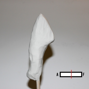
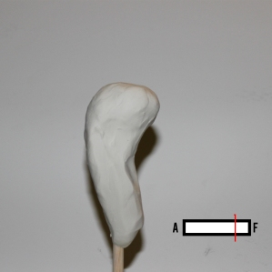
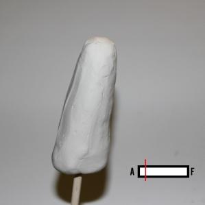
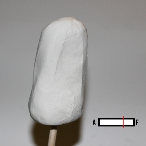
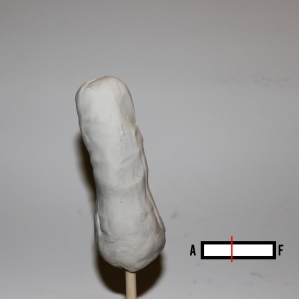
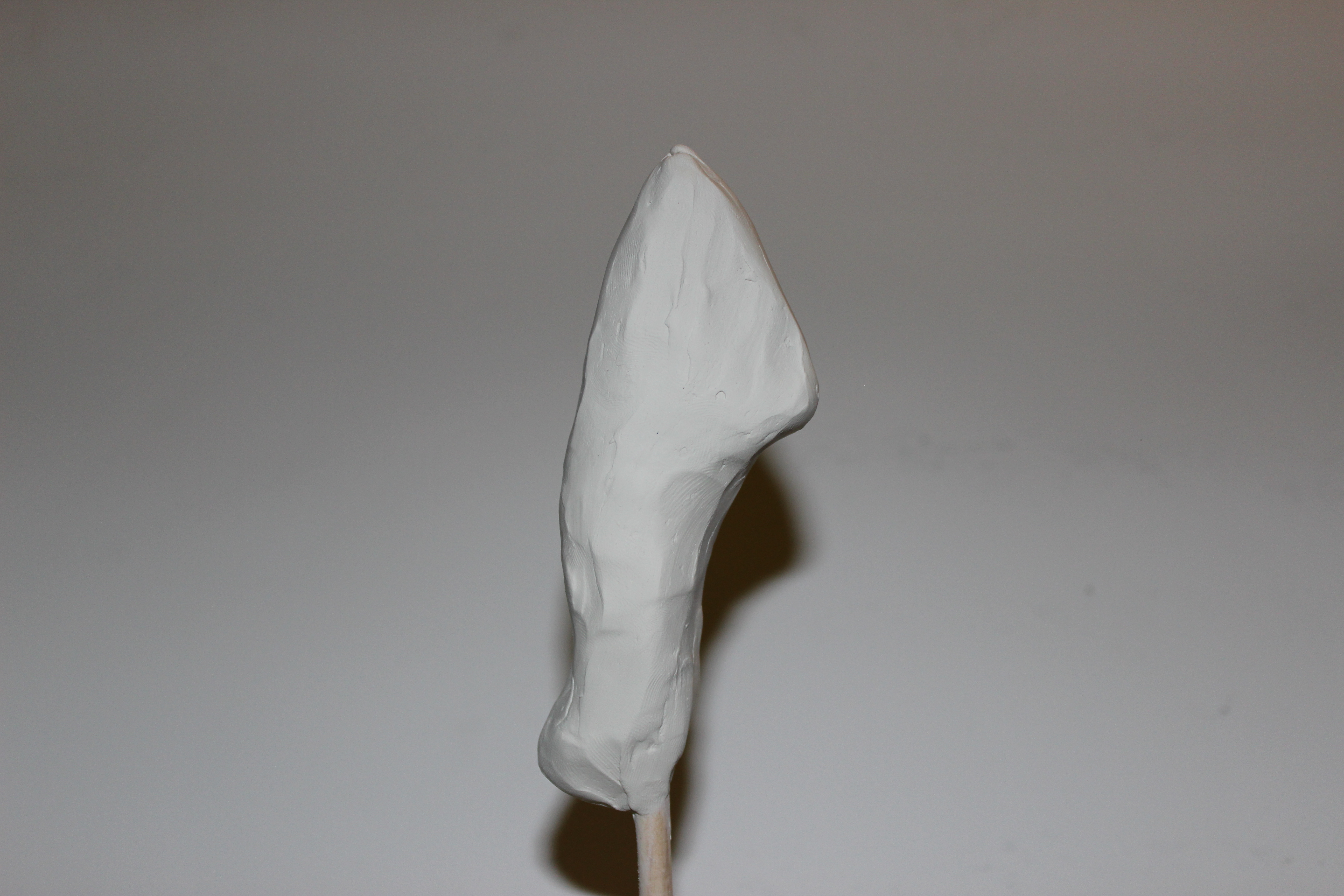
Basket concept:
The standard bought bedding for cats usually comes in the form of a soft bed or basket. I looked into this style as a concept, but soon realised it wouldn’t work. When talking to other pet owners, they all said that these forms of bedding are so obtrusive and tacky. I want to design a product that is sleek and subtle. Also, It would be hard to incorporate a type of storage, and still give the cat complete comfort.

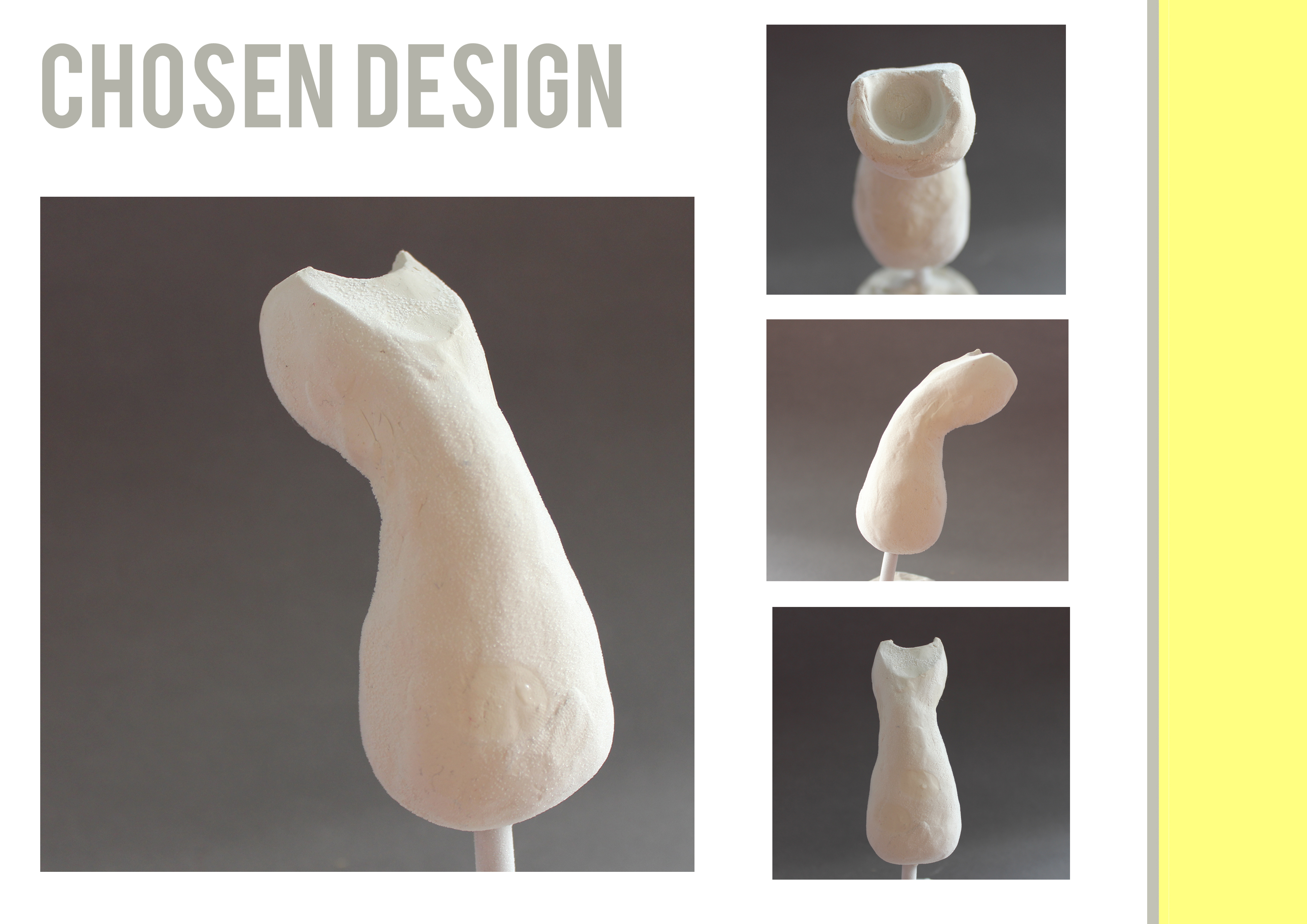
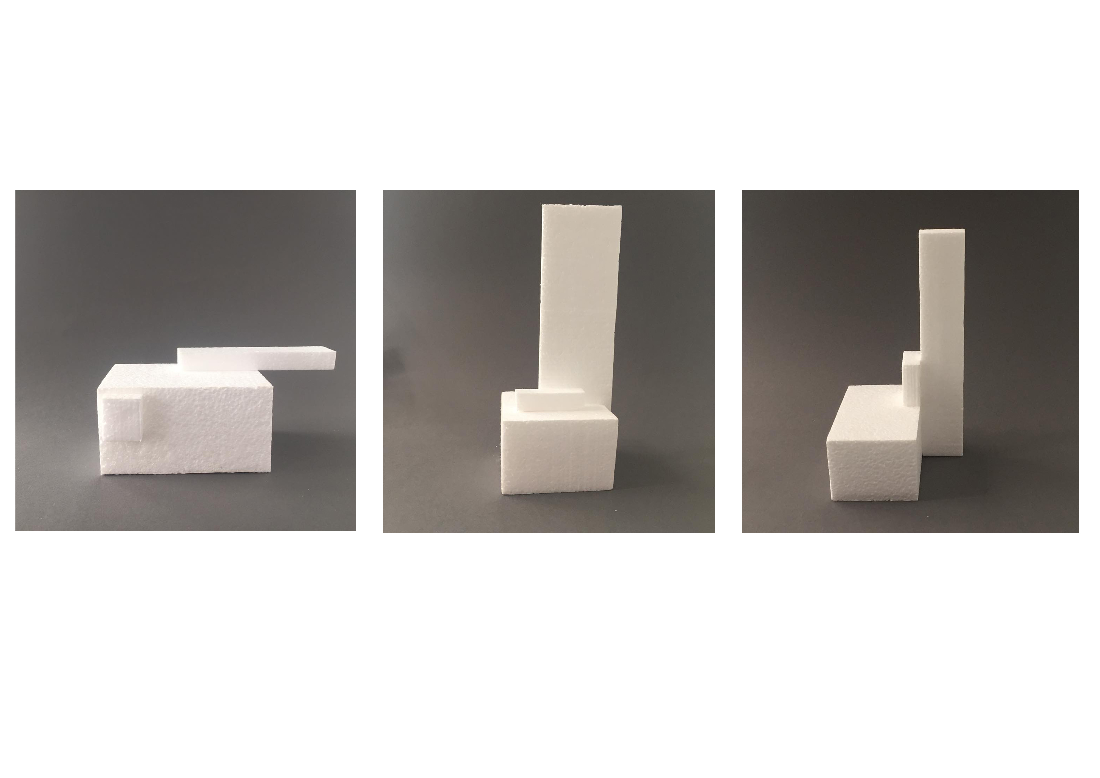
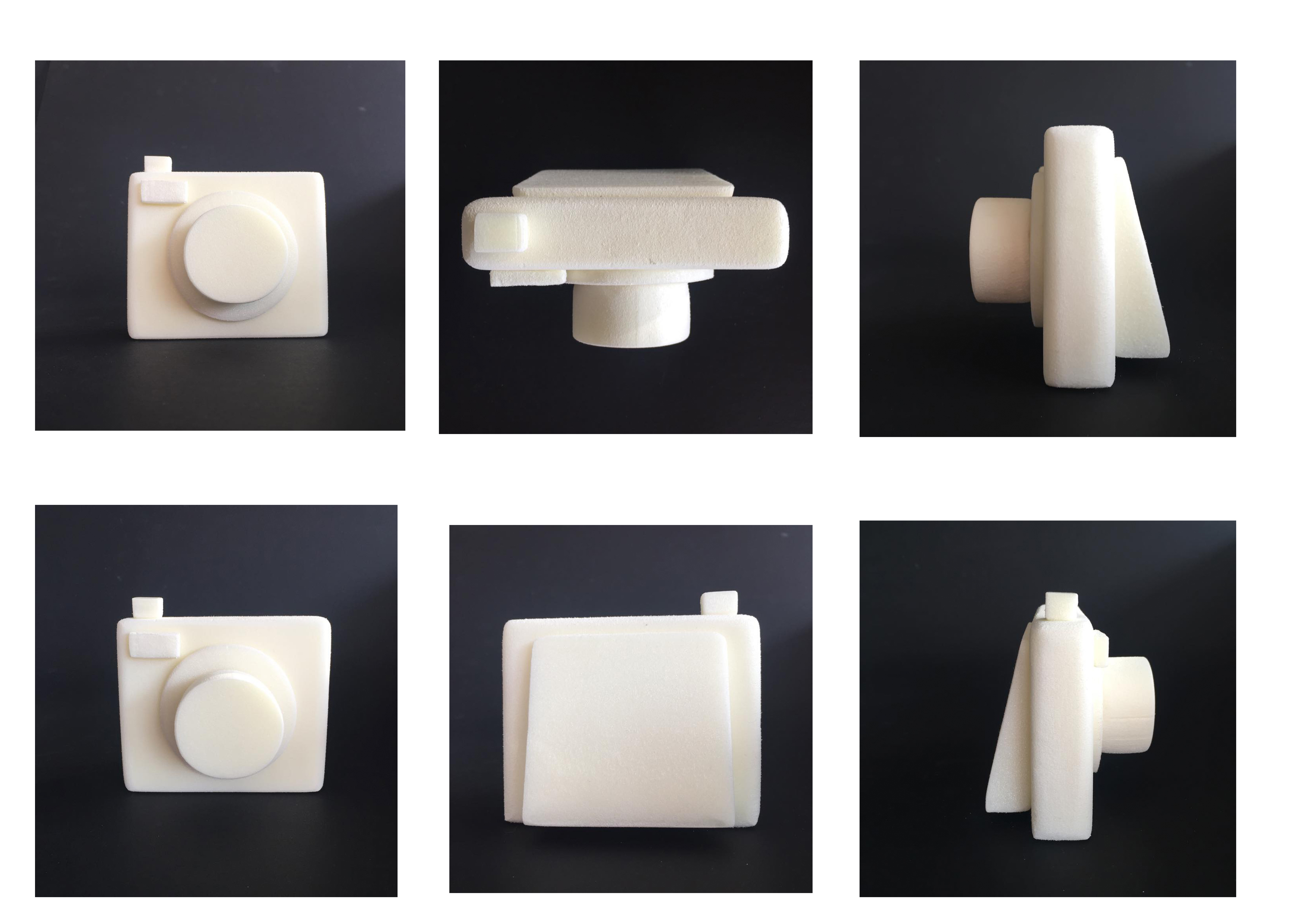
CHOSEN DESIGN:

WHY A BOX:
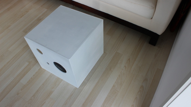
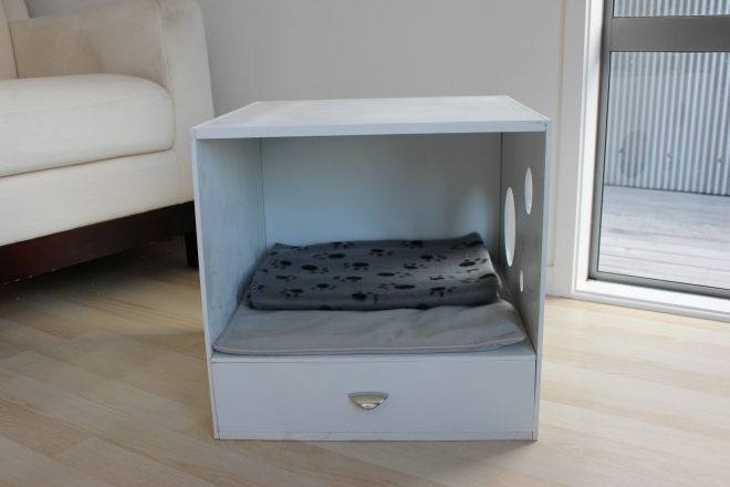
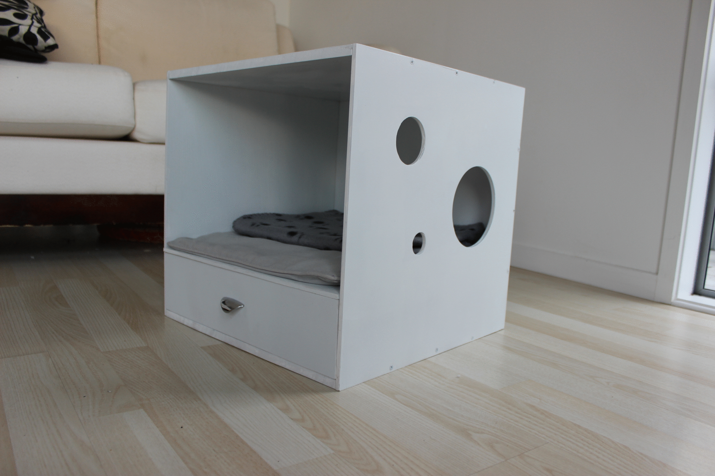
The reason why I decided on the idea of a box, is because it is the most practical. The context for my design is a compact modern home, a box type design makes it easy to fit in to small spaces and is unobtrusive. The design is a simple style that would be compatible with a range of homes. The shape of the box is consistent with modern furniture. When the box style is turned around, it can discretely hide the sleeping area. And of course, everyone knows, cats love boxes.

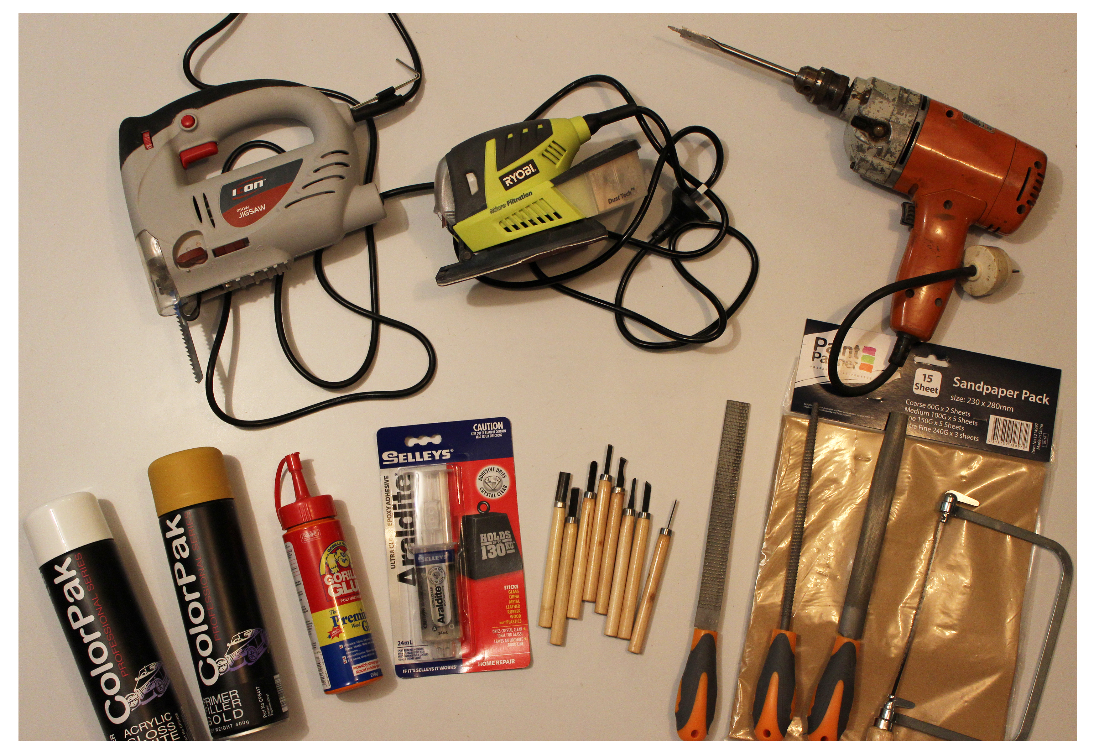
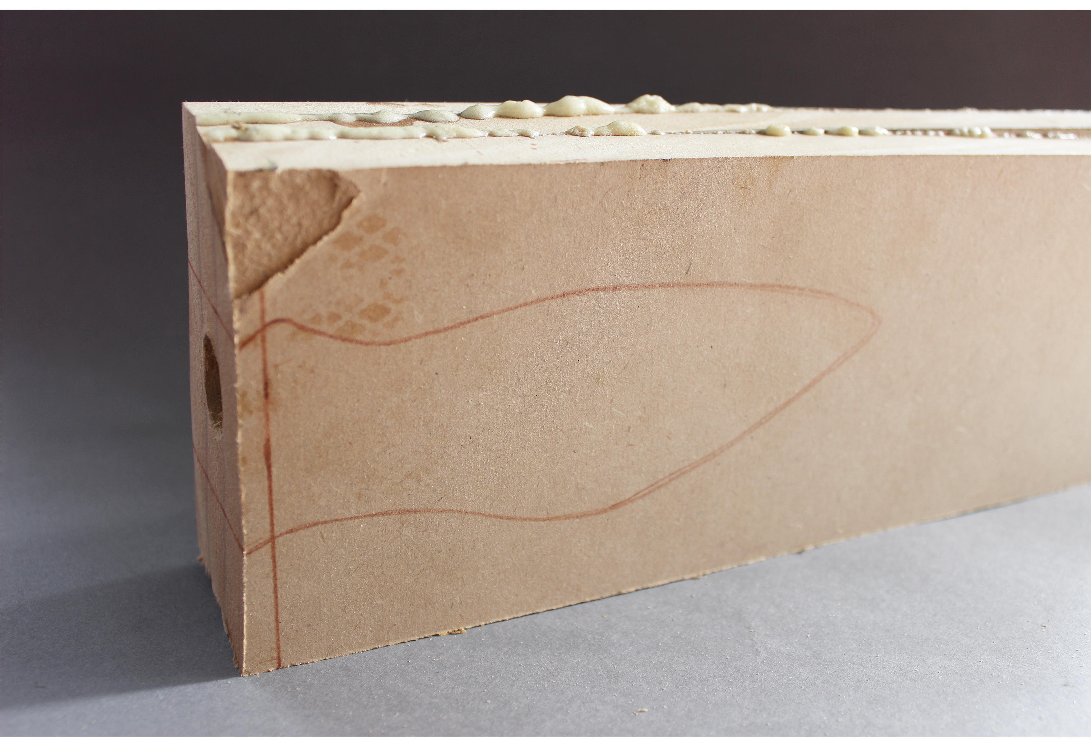
CREATION:
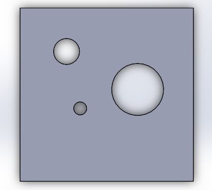
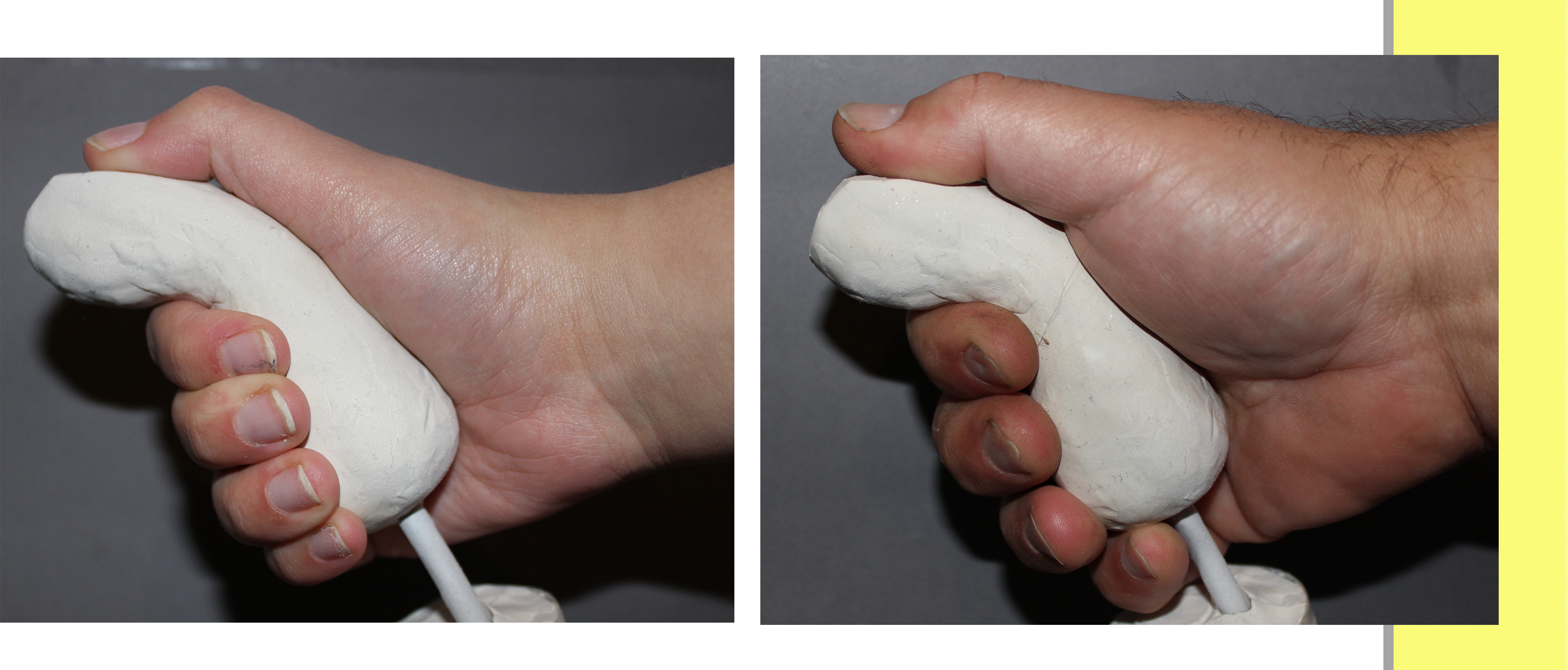
I wanted my design to be 400mm x 400mm because this was the base size of a standard cushion. I started by cutting the walls, base and roof to 400 x 400.
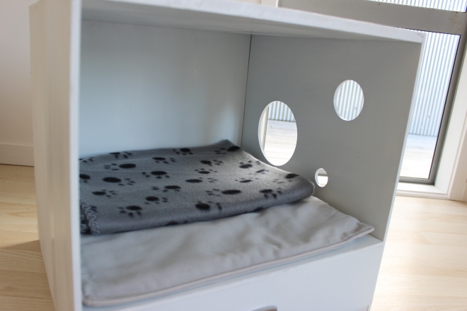
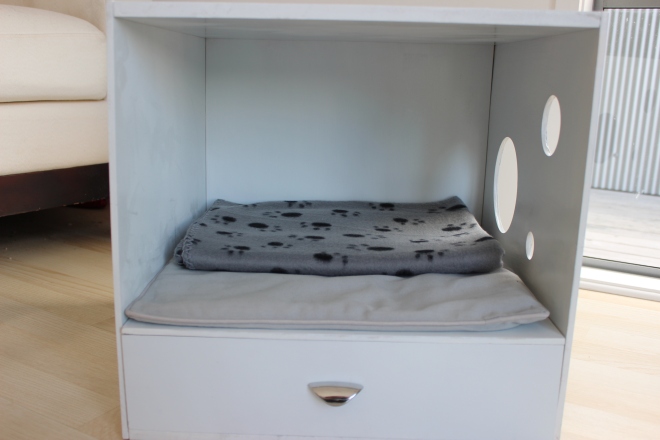
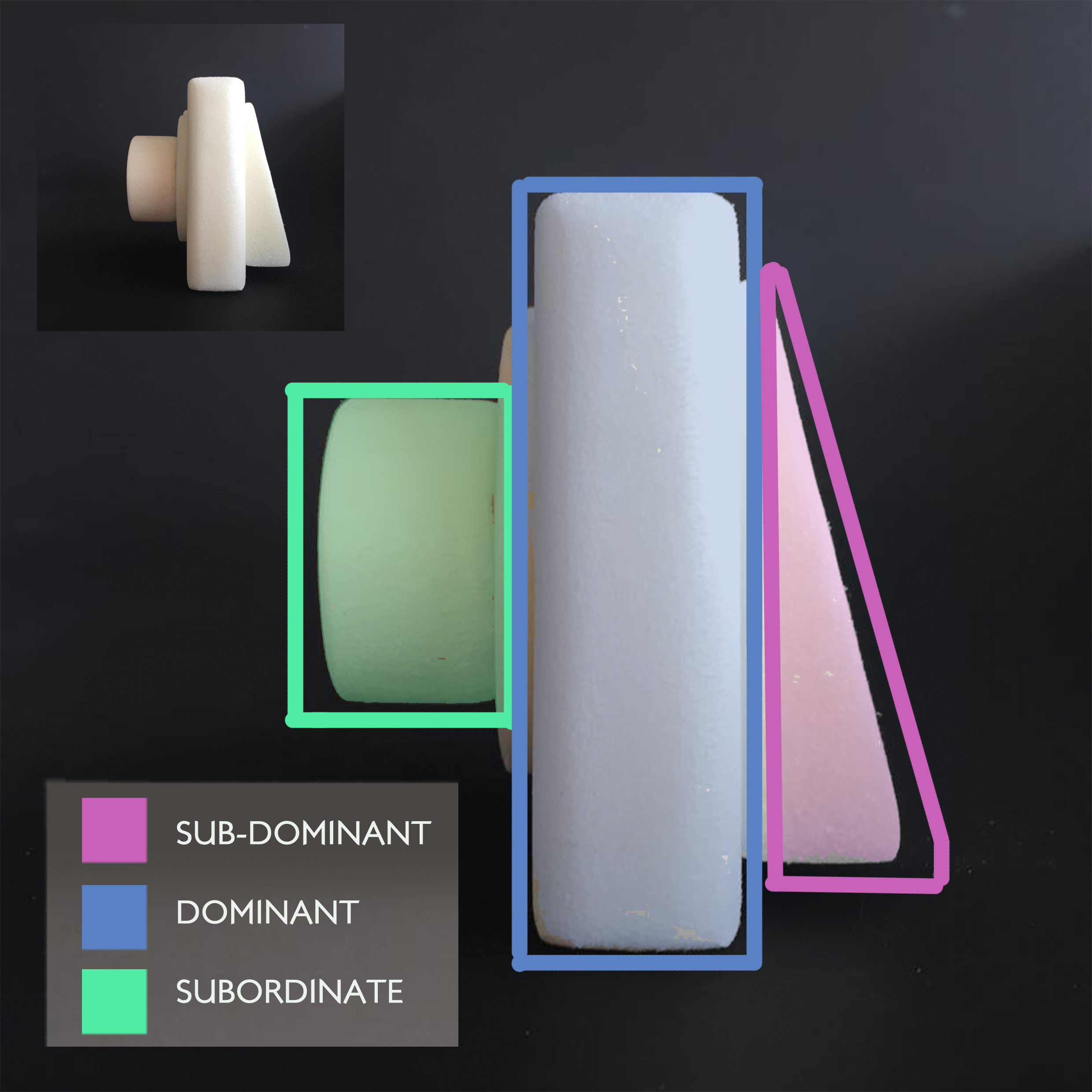
For one of my walls, I chose a circle design. The three cut outs gives a more spacious environment for you’re cat, even though they are still closed in. The biggest circle is big enough for the cats head to fit comfortably out of. The second two holes are the appropriate size for the cats paws. This gives the cat interaction with the box and its owner. I cut this side out using solid works and the laser cutter.
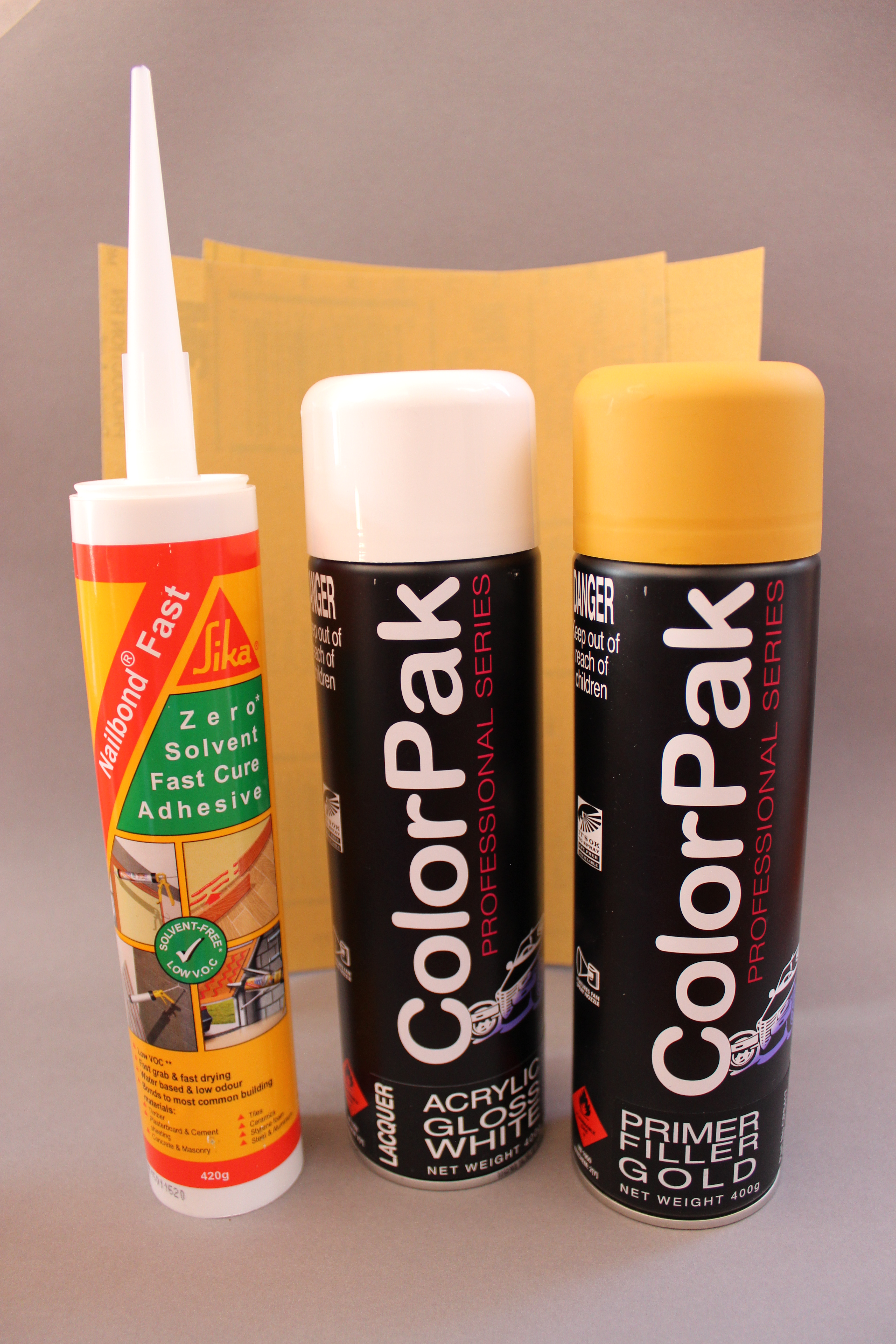
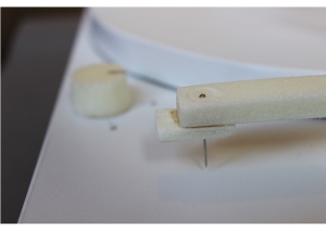
I primed all my sections with MDF sealer and spray painted them white. I screwed all the sections together. I hand created the drawer and used drawer runners to give it a smooth motion.

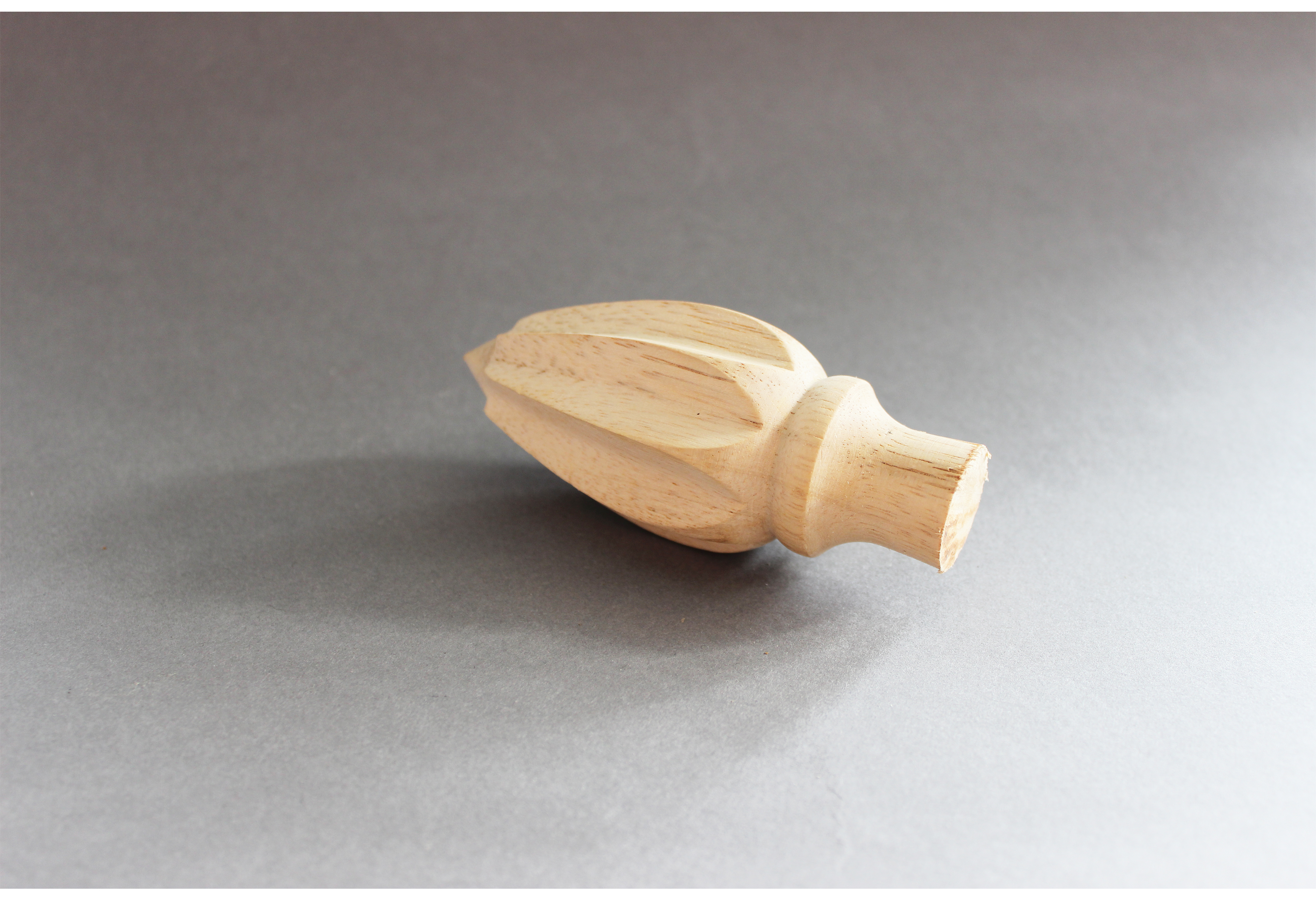
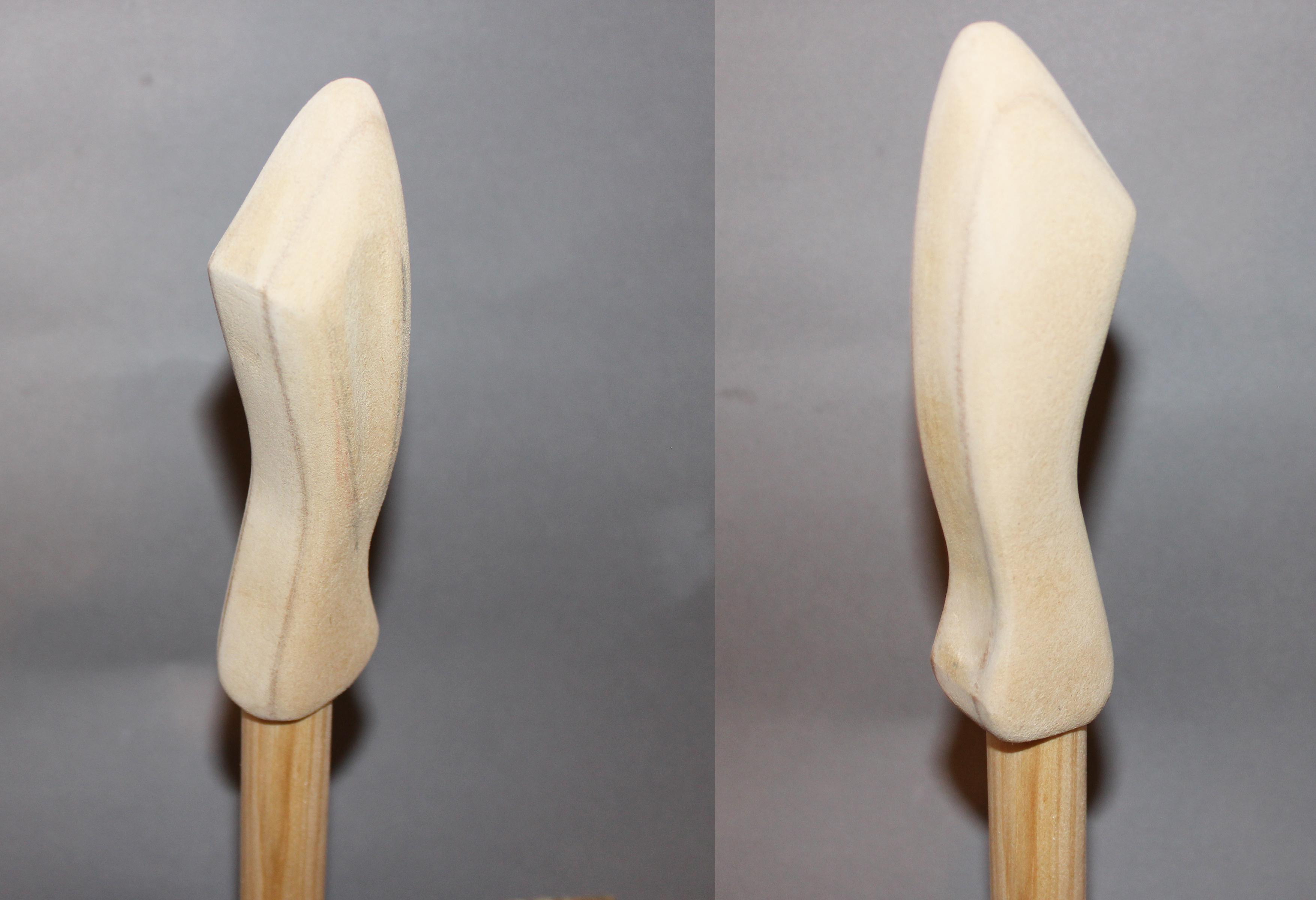
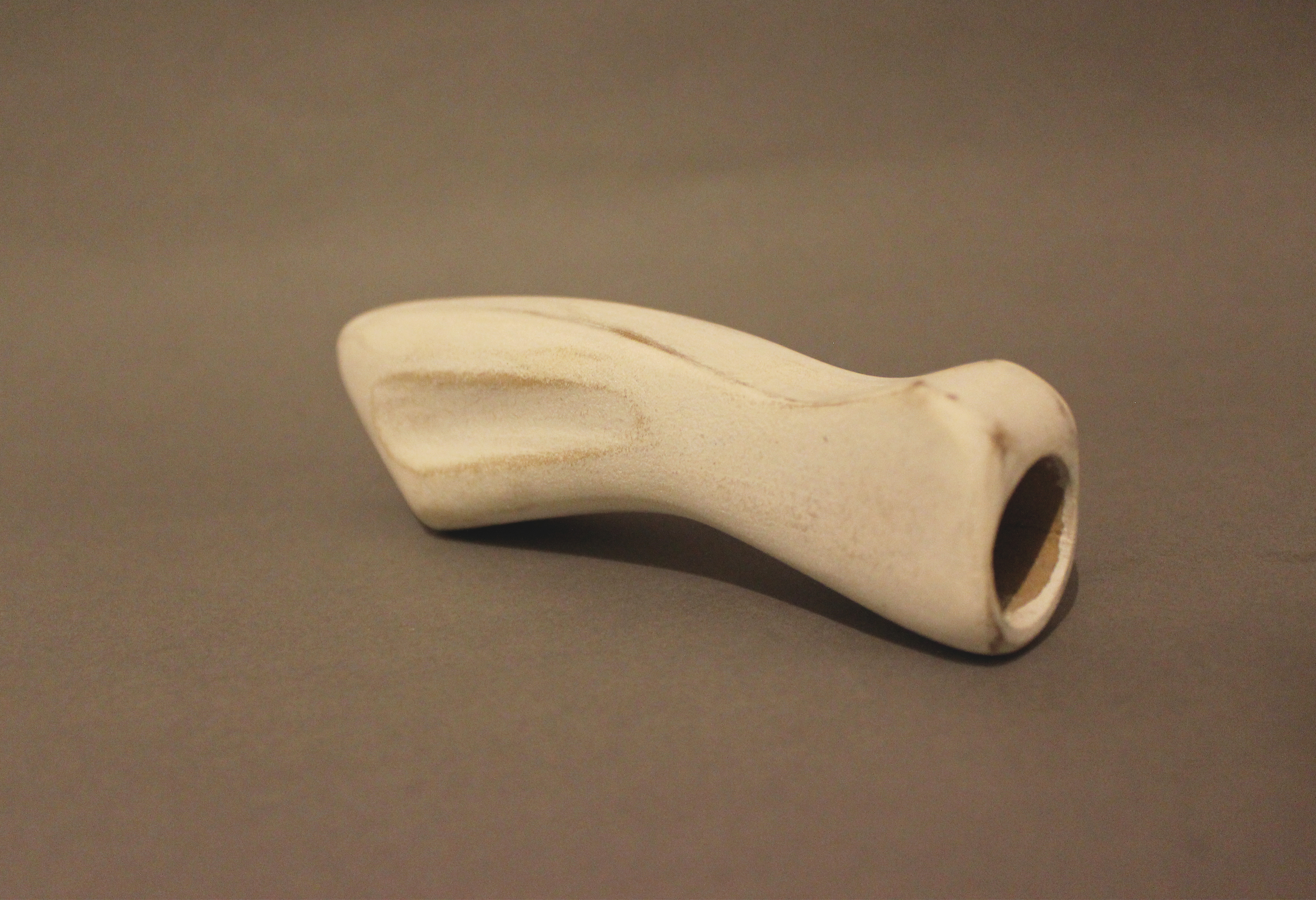
For the drawer handle I used a silver handle that reminded me of a cats tongue. For the bedding, I used a flat cushion, perfect texture for your cats claws. I also added a soft fleece cuddly blanket.
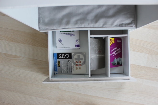
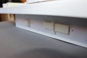
For the drawer, I created 4 sections. Suitable for all your cats medications, including : flea treatment, worm tablets, progress book and vitamin treats.
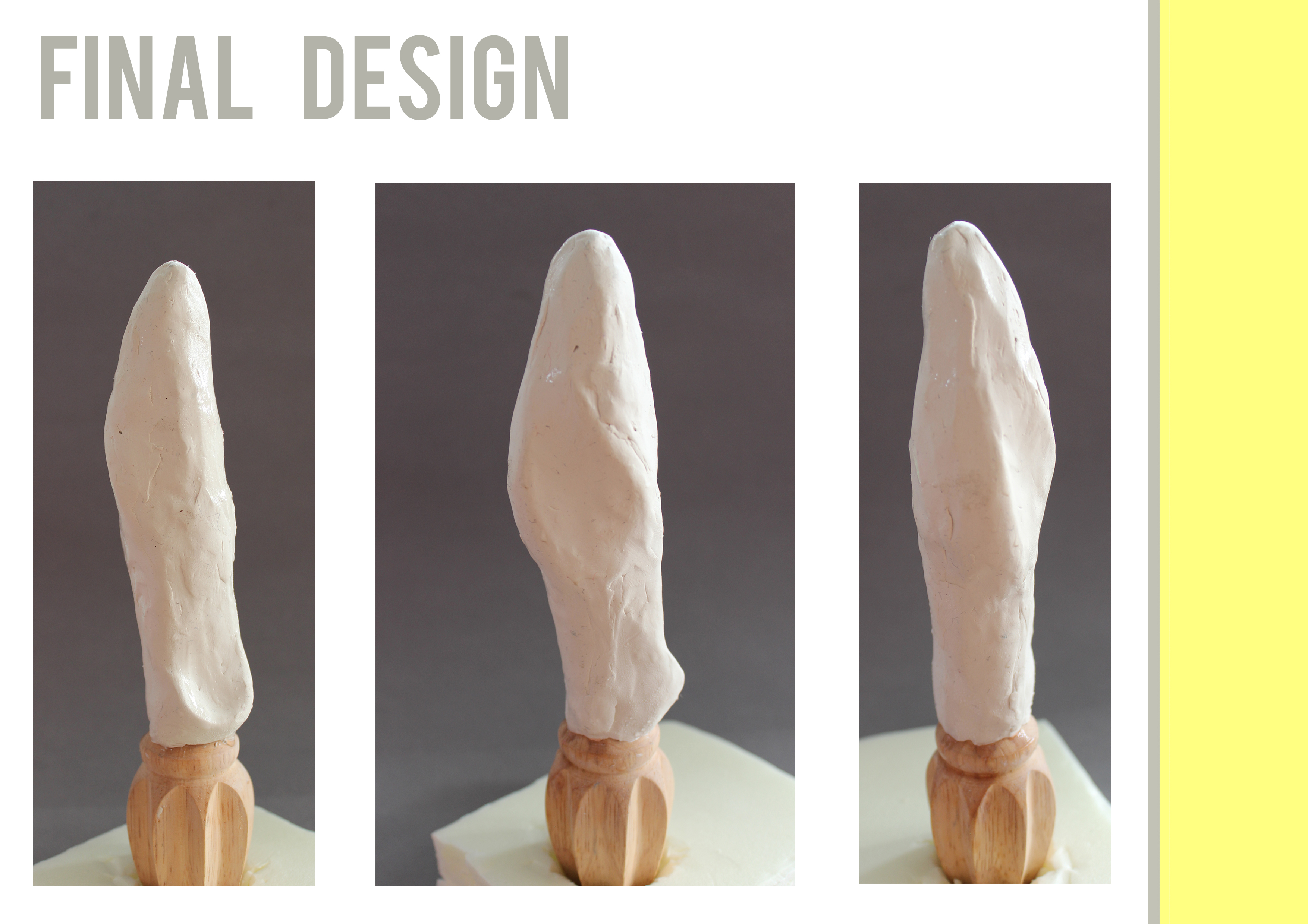
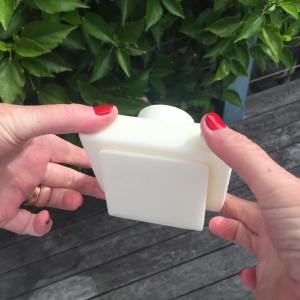
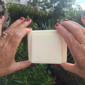
Final Design:
The name that I came up for my product is “The Cat Cube”. This fits my product perfectly because it is frankly, a cube for a cat. I am very happy with the outcome, which I believe is due to my organisation and keeping a tight schedule.


PRESENTATION BOARD:


